If the last five years of your reading life have been spent inside fantasy romance novels, dark courts, mortal bargains, mossy clearings, and candlelit feasts, then you already know exactly what you want your wedding to look like. You just haven’t found a guide written for it yet. Every “fairy tale wedding” post online defaults to pastel princess energy. That’s not the aesthetic you’ve been highlighting on your Kindle at 2 a.m.
This post is the color guide for the romantasy wedding: the BookTok bride’s version of fantasy, rooted in the natural world, layered with warm metallics, and allergic to anything pastel. If you came here from our broader guide to fantasy wedding color palettes, this is the dedicated romantasy cut. Four palettes, all hex-coded, all styled for the couple who wants a wedding that looks like the scene in the book you’ve reread three times.
The romantasy bride isn’t looking for fairy tale pastels. She’s looking for moody, mystical, rooted in the natural world: warm metallics, cathedral darkness.
In This Article
Why Romantasy Has Become the Biggest Wedding Aesthetic Influence of 2026
Over the last three years, fantasy romance, or romantasy, has quietly become the dominant aesthetic influence on young wedding planning. Pinterest is tracking a surge in dark fantasy wedding searches. Romantic-fantasy book communities have built entire visual vocabularies around candlelit feasts, forest bowers, dark formal attire, and ancient-world ceremony. Couples who grew up on those novels are now planning weddings and reaching for exactly that visual language not because they’re trying to cosplay a specific book, but because the aesthetic itself has become what “romantic” looks like for an entire generation of readers.
The aesthetic has a clear shape. It’s dark. It’s layered. It’s warm-metallic rather than cool-metallic. It’s grounded in nature such as moss, antler, ivy, candlelight, and bare branches, rather than in cartoon-fairy imagery. It uses jewel tones as accents, not as anchors. And critically, it reads as novel-worthy rather than theme-party. That distinction is the whole game.

The Rules of a Romantasy Wedding Palette
A palette only reads as romantasy if it hits these five rules. Break any one and you’ll drift either into generic gothic or into children’s-fairytale territory.
- Depth over brightness. Every anchor color should be dark or deeply saturated. Pastels are never anchors. Pastels are, at most, a single breathing-space accent.
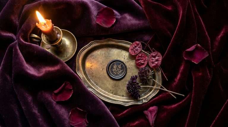
- Warm metallics only. Antique gold, aged brass, burnished copper. Never silver. Never chrome. Never rose gold. The warm metallic is the thing that separates fae from fairy.
- Organic, not iconographic. Moss, antler, ivy, bare branches, feathers, dried botanicals, candle wax. Not glitter, not sparkles, not clip-art wings.
- Jewel tones as accents, not anchors. Emerald, sapphire, violet, garnet can appear, but they support the dark neutrals. They never lead. A palette anchored on emerald is a jewel-tone wedding, not a romantasy one.
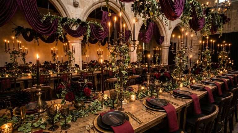
- Candlelight is structural. Every romantasy palette assumes warm candlelight as the primary light source. Cool LEDs will flatten all four of the palettes below beyond recognition.
Keep those five rules and almost any dark-nature palette will read as romantasy. The four below are the ones we see working most consistently.
Palette 1: Enchanted Woodland Court
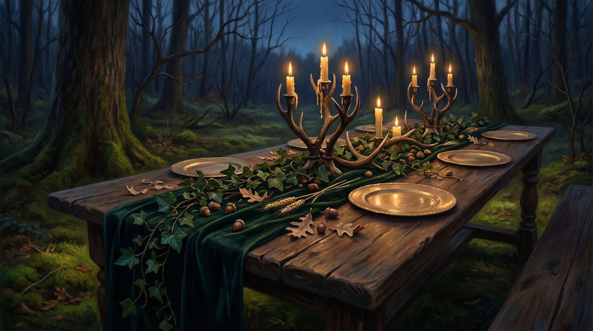
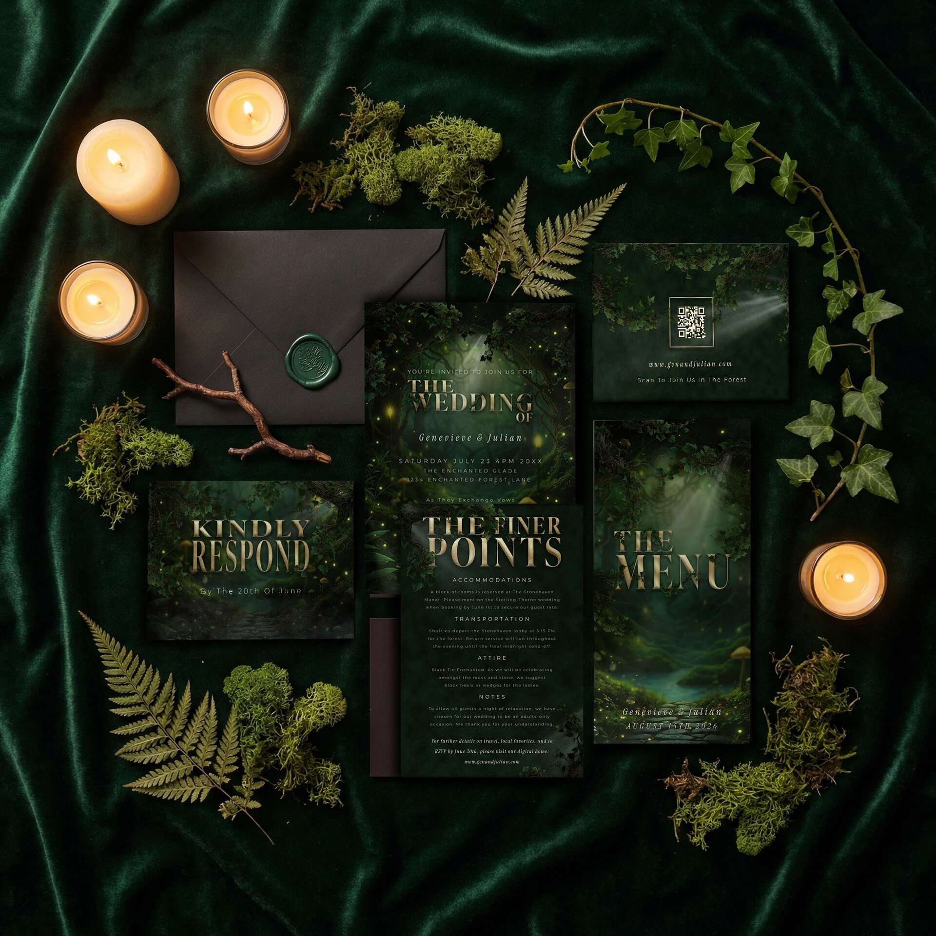
The “found a clearing in the ancient forest and held the ceremony there” palette. And the closest visual match to a real ThornBloom set: the Enchanted Forest Suite you can see in the photograph above. Same Invitation, Kindly Respond, Finer Points, Menu, QR card, and wax-sealed envelope: read here as a woodland fae court banquet rather than as autumn. It’s the most visual match for a fae-adjacent wedding in a wooded or garden venue, and the only Suite in this post you can buy today.
#1A2F25
#526A5E
#6B4423
#D1B28C
#F1E6D0
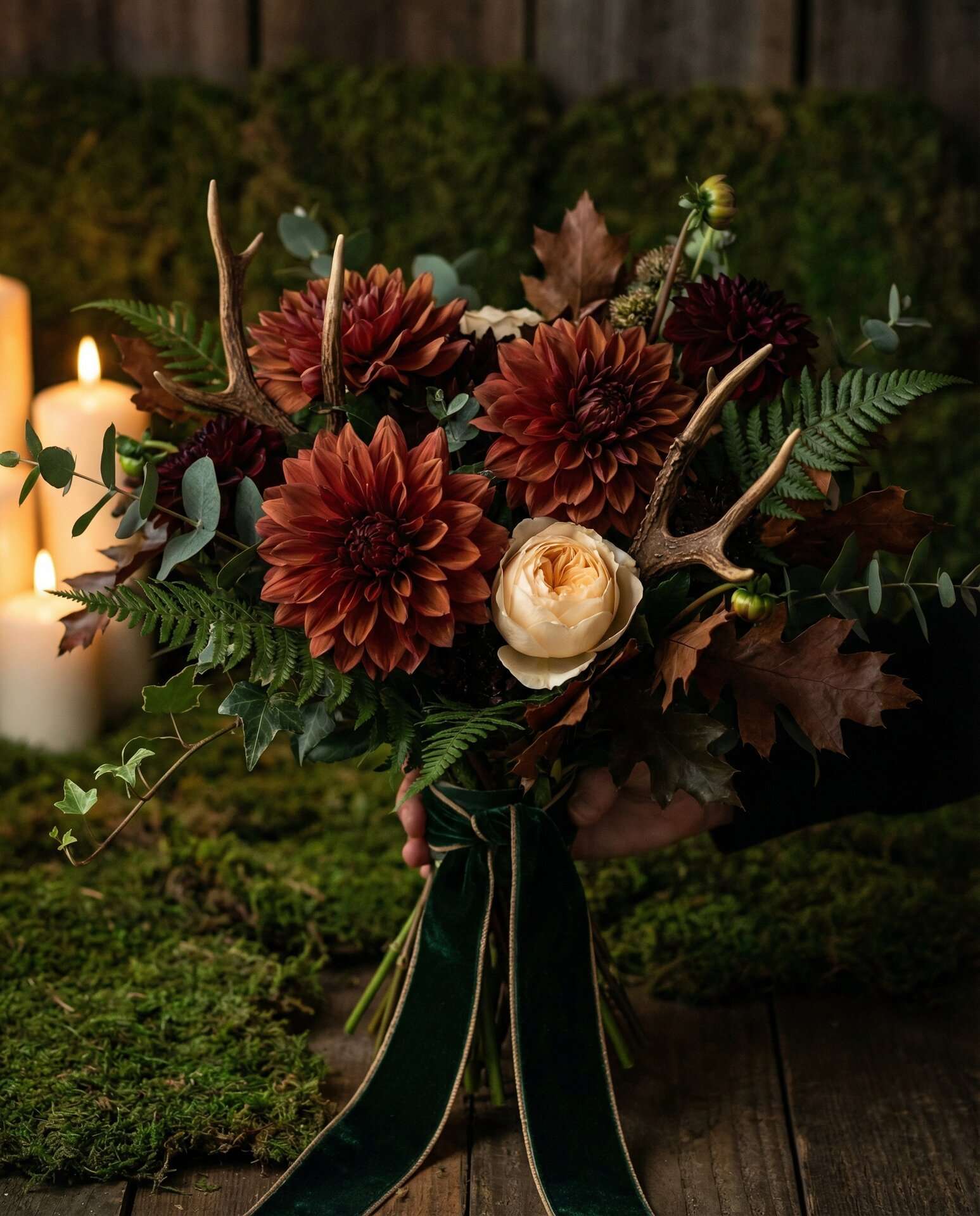
Forest green is the anchor. Think velvet linens, deep fern garlands, trailing ivy, dark eucalyptus. Antler brown grounds the palette in the earth: wooden charger plates, antler candelabra, reclaimed wood signage. Moss gold shows up in bridesmaid dresses and in the secondary florals. Antique gold is the one bright element: flatware, candleholders, the printed gold effect on the invitations. Starlight ivory appears only as a fine trim: the edge of a place card, the calligraphy on a menu, a single cream bloom in an otherwise dark bouquet. If you’re drawn to this palette, the Enchanted Forest stationery collection is built in this exact range.
Palette 2: Shadow Court
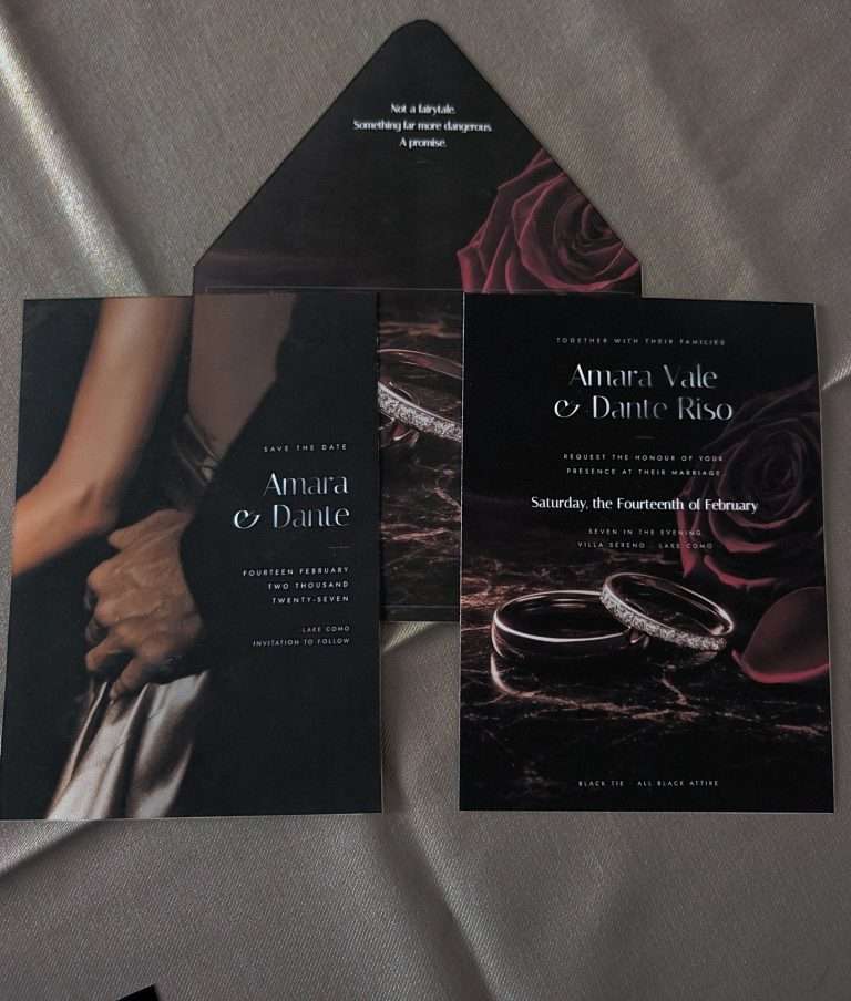
The palette for the reader who skipped straight to the darker, more political half of the romantasy shelf. Cathedral courts, candlelit throne rooms, ceremonies held under stone vaulting. This one pairs beautifully with our Dark Romance collection.
#351E28
#0E0E0E
#D1B28C
#5C1A1B
#F1E6D0
Plum Noir (#351E28) is the anchor: ThornBloom’s signature dark romance color, deep enough to read as cathedral shadow but warm enough to come alive under candlelight. Obsidian black structures the palette: groomsmen, menu headers, envelope liners. Antique gold is the only consistent light element. Blood red should appear in exactly one place per setting: a trailing ribbon, a single cluster of oxblood roses, or the wax seal on the invitation. Never as a major surface color. Warm ivory is the breathing room. Florals lean dramatic: black baccara roses, black hellebores, dark dahlias, trailing amaranth, calla lilies in deepest burgundy.
Palette 3: Autumn Fae
The fall-specific romantasy palette. For a late-October or early-November wedding in a forest, estate, or historic venue with fireplaces and candlelight. This palette bridges into our dedicated Fall Fantasy Wedding Color Palettes post if you’re also planning seasonally.
#1A2F25
#8B4513
#3C3631
#D1B28C
#F1E6D0
Forest green anchors, copper carries the fall warmth, charcoal structures the formal attire, and antique gold keeps the palette from reading as rustic. The florals that make this palette sing: copper dahlias, burnt orange ranunculus sparingly used, dried wheat, oak branches, acorn accents, pomegranate, dark chocolate cosmos. Keep the copper restrained. It’s the accent, not the base. Over-use copper and the palette slides toward “rustic fall,” the one thing a romantasy palette must never do.
Palette 4: Twilight Fae
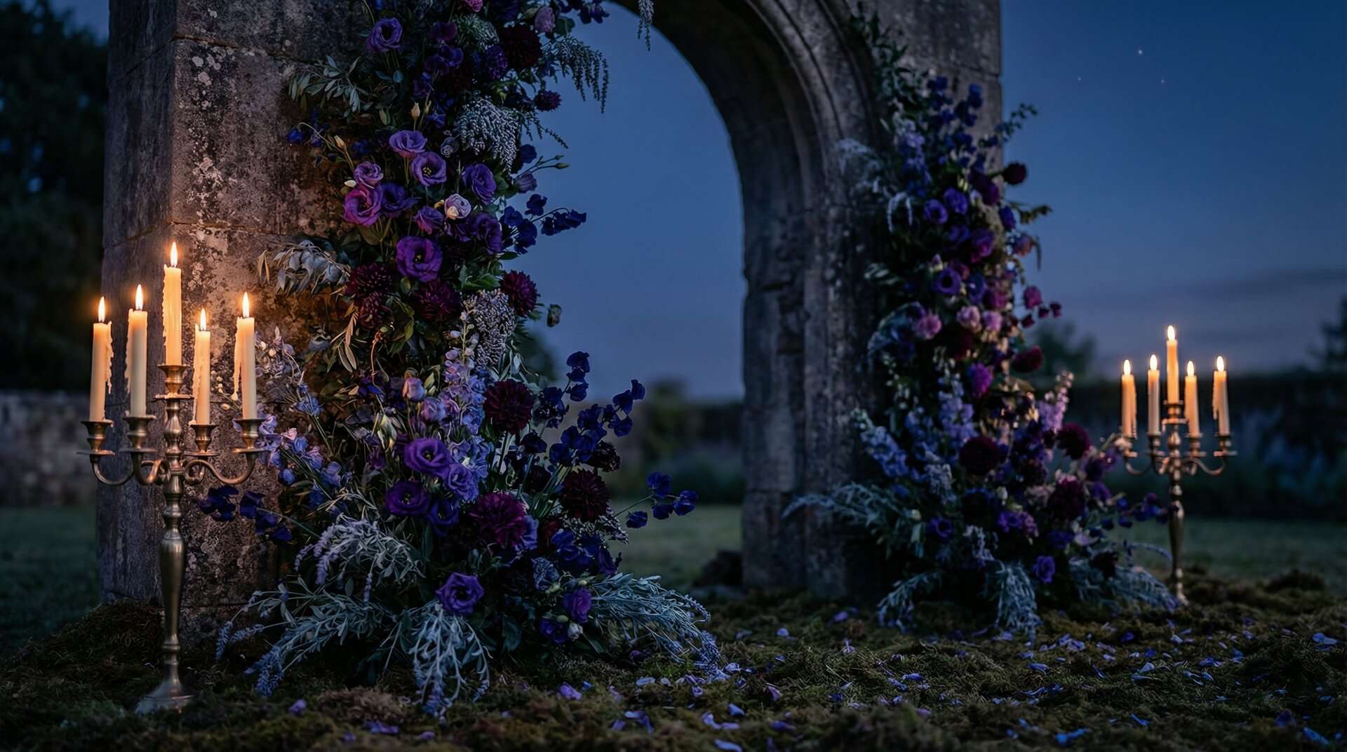
The most unusual of the four, and the most cinematic. A violet-forward palette for a blue-hour ceremony, a garden-at-dusk reception, or a venue with stained glass and deep cool shadows.
#2A1B3D
#8B7F9E
#1A1A2E
#D1B28C
#F1E6D0
A note: silver lavender is one of the few non-warm-metallic elements we ever recommend in a romantasy palette, and it only works here because it reads as twilight sky rather than as metal. Keep it soft, matte, and in a supporting role. The antique gold is still the only actual metallic in the palette. Deep violet and midnight blue do the heavy lifting: linens, florals (lisianthus, dark sweet pea, deep violet dahlias), and bridesmaid dresses. This palette wants a dusk ceremony and a candlelit reception that transitions into full dark by the time the dancing starts.
How to Build a Romantasy Mood Board Without Copying Book Cover Art
This is the trickiest part. You want the feeling of the books. You don’t want your wedding to look like a tribute page, and you definitely don’t want trademarked imagery on your stationery. A few practical rules:
- Pin atmospheres, not illustrations. Forests at blue hour, candlelit tables, velvet textures, antler centerpieces, old stone walls. Skip published book covers entirely.
- Describe the feeling, not the fandom. “Ancient forest court at twilight” works. “Night Court” does not. “Starlit ceremony with dark formal attire” works. “ACOTAR wedding” does not. Your vendors will understand the first version perfectly; the second version creates legal risk for everyone involved.
- Use the aesthetic vocabulary, not the IP vocabulary. Fae, dark fae, romantasy, dark court, fantasy romance, mortal bargain, forest bower, candlelit feast: all generic and brand-safe. Specific named courts, characters, and titles are not.
- Lean on the visual rules, not the specific source. If your mood board follows the five rules above (depth, warm metallics, organic motifs, jewel-tone accents only, candlelight as structural light), it will read as romantasy to any reader who knows the genre, no matter what books you drew inspiration from.
This is also how we built the dark fantasy wedding stationery guide: aesthetic-first, fandom-neutral, entirely original artwork that evokes the feeling without borrowing any specific IP.
Stationery That Matches a Romantasy Palette
A romantasy invitation suite isn’t a plain card with a decorative border. It’s an illustrated scene: full-bleed, edge-to-edge artwork that looks like a page from a novel’s deluxe edition. A few specifics:
- Full-bleed dark backgrounds. The color is the scene, not the trim. The text sits inside the atmosphere.
- Ornate serif typography. IvyPresto, Cinzel, Cormorant Garamond: serif fonts with weight and history. Never sans-serif. Never “wedding script” curlicues.
- Natural motifs in the artwork. Bare branches, moss, trailing ivy, antlers, stars, stone. No wings. No wands. No tiaras.
- Printed gold effect or gold ink on every key piece. The invitation, the save the date, the menu headers. Warm gold is the visual signature of the entire aesthetic.
- A full suite, not a one-off invitation. The power of a romantasy wedding comes from the cohesion across every piece of paper a guest sees: the save the date, the invitation, the RSVP, the menu, the place cards, the signage. Every ThornBloom suite is designed to read as a single immersive world, not as a set of coordinated parts.
Our suites are done-for-you. You send your details, approve a proof, and receive the finished files. Most pieces can also be printed and shipped through the studio’s printing partners, by quote.
FAQ
What is a romantasy wedding?
A romantasy wedding is a celebration inspired by the aesthetic of fantasy romance novels, the genre often called “romantasy” by readers. It’s characterized by dark, moody color palettes, warm metallic accents (especially antique gold), organic natural motifs, candlelit atmosphere, and a dark formal dress code. It’s distinct from a traditional “fairy tale” wedding, which tends to lean pastel and princess-coded. Romantasy is closer to ancient forest courts, cathedral ceremonies, and candlelit feasts.
What colors are used in a romantasy wedding palette?
Dark, deep, layered colors anchored by one or more of: forest green (#1A2F25), Plum Noir (#351E28), obsidian black (#0E0E0E), deep violet (#2A1B3D), or midnight blue (#1A1A2E). Warm metallics such as antique gold (#D1B28C), burnished copper, and aged brass are essential. Jewel tones can appear as accents but never as anchors. Pastels are avoided entirely.
Is a romantasy wedding the same as a gothic wedding?
They overlap significantly but they’re not identical. Gothic weddings lean heavier into black, cathedral architecture, and strictly dark-Victorian visual cues. Romantasy is broader. It includes gothic, but also includes woodland fae aesthetics, court-inspired settings, twilight and dusk palettes, and warmer nature-rooted imagery. Every gothic wedding is romantasy-compatible; not every romantasy wedding is gothic.
How do I plan a romantasy wedding without copying a specific book?
Pin atmospheres rather than book covers, describe your wedding in generic aesthetic language (fae-inspired, dark court, candlelit forest) rather than in specific fandom terms, and follow the visual rules: depth, warm metallics, organic motifs, jewel-tone accents, candlelight. Your wedding will read as romantasy to anyone who knows the genre without borrowing any trademarked IP.
What’s the difference between fae and fairy in a wedding aesthetic?
“Fairy” reads as children’s-book imagery: pastel wings, glitter, tiaras, soft pink and lavender. “Fae” reads as ancient-world imagery: moss, antler, candlelight, dark forests, warm gold, and dark formal attire. A romantasy wedding is fae, not fairy. The single biggest swap is dropping anything that looks like glitter or wings and replacing it with natural texture such as moss, bark, candle wax, and velvet.
What flowers work for a romantasy wedding?
Black baccara roses, dark dahlias, burgundy ranunculus, trailing amaranth, dark hellebores, chocolate cosmos, deep violet lisianthus, dried wheat, pomegranates, trailing ivy, bare branches, and dark eucalyptus. Keep the florals grounded in nature rather than in cultivated-garden imagery. Skip anything pastel, anything in pinks and yellows, and anything too structured.
Ready to bring your romantasy palette to life on paper? Start with our Wedding Stationery 101 to choose the right stationery pieces.
Design a Wedding That Reads Like the Book You Keep Rereading
If any of these palettes made you pause, the ThornBloom collections were built for you. The Enchanted Forest stationery collection is the closest visual match for the Woodland Court and Autumn Fae palettes: full-bleed forest artwork, antique gold typography, moss and botanical motifs. The Dark Romance collection carries the Shadow Court palette across every piece in the suite. For deeper inspiration, our coverage of moody wedding color palettes trending in 2026 tracks how the broader dark-fantasy aesthetic is evolving. And if you’d like a planning tool that feels like it belongs in the same world, our free Wedding Planner Bundle is a three-format kit built in full dark luxury. Your planning documents will look as intentional as the wedding you’re designing.