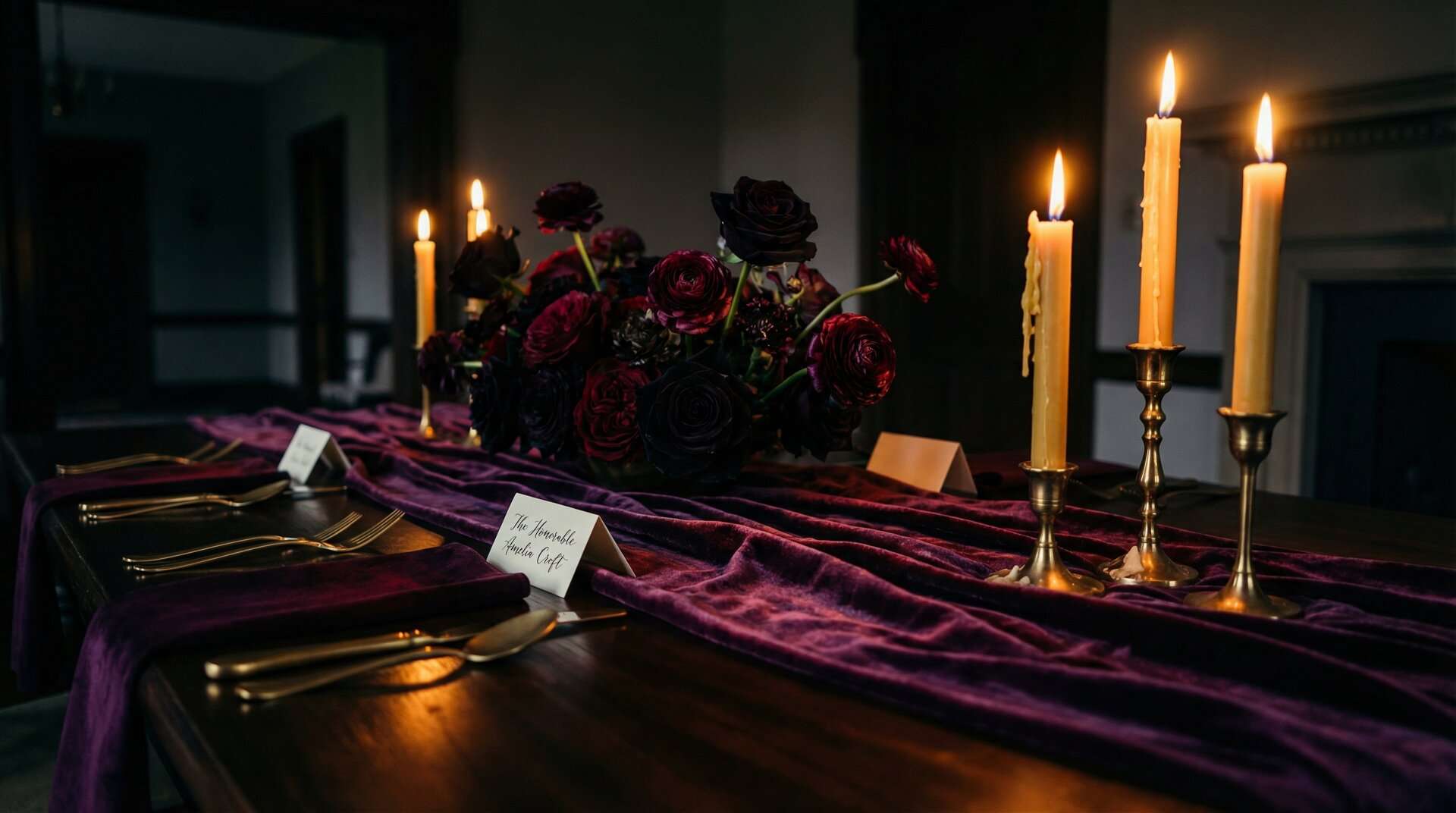
If you have been searching for a plum noir wedding palette that is darker than burgundy, richer than black, and moodier than oxblood, you have been searching for Plum Noir. It just did not have a name yet. Plum Noir is a deep, wine-bruised purple: warm, atmospheric, and impossibly romantic in candlelight. It has quietly become one of the most saved wedding palettes of 2026. It is the aesthetic every bride hoarding dahlias and velvet on Pinterest has been circling without quite landing on, the one that goes unnamed in every “moody,” “gothic,” and “dark romantic” board. This is the color you have been trying to name.
Plum noir is one of the signature palettes for dark fantasy weddings u2014 see our dark fantasy wedding planning guide for complete planning inspiration.
Plum Noir is what the next generation of dark romance couples are actually using in 2026: a deeper, more sophisticated shade that reads as cathedral shadow rather than wine spill.

In This Article
Table of Contents
- What Is Plum Noir?
- Why Plum Noir Is Replacing Burgundy for 2026
- The Plum Noir Wedding Color Palette
- Plum Noir vs. Burgundy vs. Oxblood: Which Dark Red Is Right for Your Wedding?
- Plum Noir Wedding Florals
- Plum Noir Tablescapes and Reception Décor
- Plum Noir Wedding Stationery and Paper
- Plum Noir Bridal Attire and Accessories
- Best Seasons and Venues for a Plum Noir Wedding
- How to Build a Plum Noir Wedding Mood Board
- Plum Noir Wedding FAQ
- Shop the Dark Romance Collection
What Is Plum Noir?
Plum Noir is a deep, warm, wine-soaked purple. Imagine a plum left on the windowsill until it turns almost black at the shoulders, still holding the red pulse of its fruit underneath. Unlike the flat eggplant tones that dominated 2000s wedding palettes, Plum Noir has warmth and candlelight in it. It reads burgundy in shadow, plum in the middle, and almost garnet where a light hits it. It is the color of a wine bottle’s shadow, the color of a library corner an hour after sunset, the color of a velvet curtain in a historic theater. If you know the feeling, you know the color.
Think of it as the new dark neutral. It behaves the way black does: it grounds a palette, flatters every other color you put next to it, and photographs beautifully. But it has enough warmth and enough character that it never reads as cold or corporate the way a true black can.
Plum Noir is also having an official moment. Pinterest named it one of five defining palette colors in its 2026 Predicts report, a signal that the platform’s algorithm is actively amplifying the trend. ThornBloom Studio has been designing in this exact palette since we began our Dark Romance collection, and we built this guide as the wedding-vertical reference for the color.
What sets a plum noir wedding apart from a generic purple wedding, a burgundy wedding, or the vague “moody” Pinterest pins of the last five years is specificity. Plum Noir is not a mood. It is a hex code, a flower list, a venue type, and a way of lighting a room.
Why Plum Noir Is Replacing Burgundy for 2026
For the last decade, every couple searching for “dark romantic wedding colors” ended up in the same place: burgundy. Burgundy bridesmaid dresses, burgundy linens, burgundy bouquet. The problem is not that burgundy is a bad color. It is that true burgundy is a bright color. It is saturated. It is active. In photographs it reads as confident red first and moody romantic second.
That is not the aesthetic 2026 couples are after. The rise of dark fantasy, cathedral weddings, candlelit estates, and romantasy-inspired styling has pulled the dark-wedding palette deeper and more restrained. Couples do not want a red that shouts. They want a red that smolders. Plum Noir is that color. It scratches the same dark-romantic itch as burgundy, but lets you build an entire wedding around it without the palette reading as loud. Pair it with Candlelight Amber, add velvet and candlelight, and the result is the modern dark romance palette everyone has been sketching toward without quite landing on.
The Plum Noir Wedding Color Palette
The plum noir wedding palette is a five-color system built around a headline trio, with two supporting colors that keep the palette from tipping either too dark or too bright. The three primary colors are the spine:
- Plum Noir:
#351E28. The anchor. Dark enough to read as neutral-black on camera but warm enough to glow in candlelight. Use it for linens, envelopes, velvet accents, and the dominant flower mass. - Oxblood:
#5C1A1B. The pulse. Think leather, velvet and old wine. It adds red warmth so Plum Noir never drifts toward flat black. Use it on ribbon, wax seals, and in the throat of every centerpiece where you want the eye to land. - Candlelight Amber:
#C4956A. The light. A warm, soft bronze-amber, never brassy yellow. Think tarnished candlestick, aged brass, and pressed gold leaf caught by a taper. Candlelight Amber is what turns a plum noir palette from gothic to romantic. Use it for flatware finish, candle metal, and metallic-effect typography.
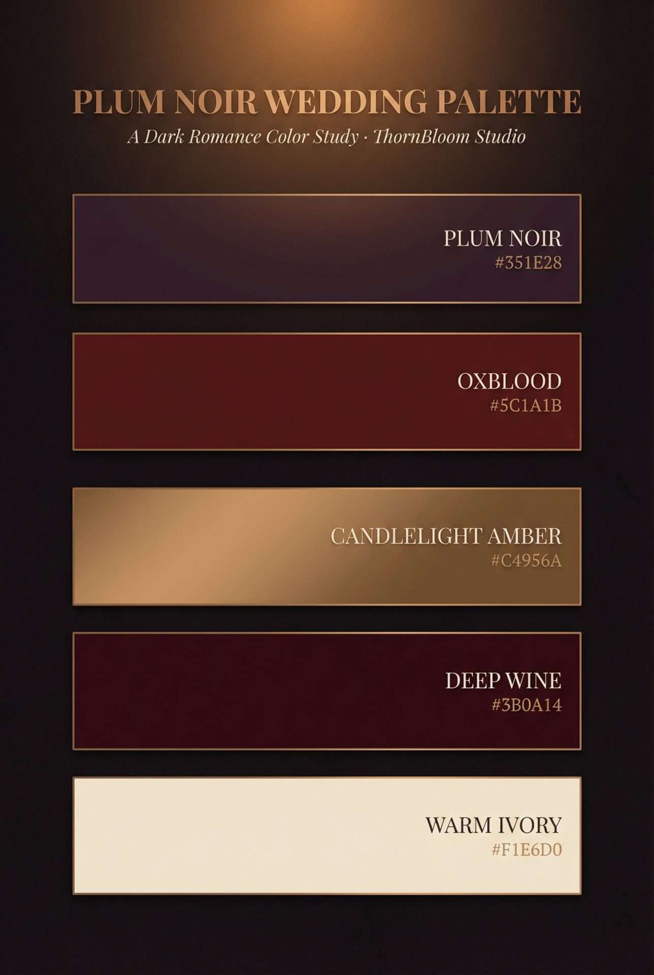
#351E28, Oxblood #5C1A1B, Candlelight Amber #C4956A, Deep Wine #3B0A14, Warm Ivory #F1E6D0: the five-color plum noir wedding palette.Supporting colors
Two supporting shades give the palette depth at the extremes: one deeper than Plum Noir for the darkest moments, one ivory for a single breath of light.
- Deep Wine:
#3B0A14. A near-black red for the accents that need to disappear into shadow. Envelope liners, calligraphy ink, shoe leather, the darkest petals at the heart of the bouquet. Deep Wine is where Plum Noir goes when you need it to go further. - Warm Ivory:
#F1E6D0. The breathing space: use it sparingly, at 5 to 10 percent of the palette maximum. Inner envelopes, place card typography, a single cream flower tucked into an otherwise dark bouquet. Never lean warm white or cool white; Warm Ivory is the exact temperature of aged vellum.
Our rule of thumb is 50 / 20 / 15 / 10 / 5: fifty percent Plum Noir, twenty percent Oxblood, fifteen percent Candlelight Amber, ten percent Deep Wine, five percent Warm Ivory. That ratio keeps the aesthetic dark-romantic rather than bridal-red, prevents the palette from collapsing into flat black, and leaves just enough ivory for the eye to rest. Tip the Warm Ivory past ten percent and the wedding starts to read traditional; drop the Candlelight Amber below ten and the room loses its candlelit warmth. The math matters.
Plum Noir vs. Burgundy vs. Oxblood: Which Dark Red Is Right for Your Wedding?
This is the question we get most often from couples torn between three colors that all live in the same dark-romantic neighborhood. Here is the honest comparison.
- Burgundy is the brightest of the three. It photographs as confident red first, moody second. Best for couples who want a dark-romantic feel but with daytime energy and traditional wedding warmth.
- Oxblood (
#5C1A1B) is deeper and more structural. It reads as leather, velvet, old wine. Best for couples who want drama but still want a color that could be called “red” without hesitation. - Plum Noir (
#351E28) is the darkest and the most atmospheric. It reads as shadow first, red second: closer to a cathedral interior than to a color swatch. Best for couples who want the entire wedding to feel candlelit and novel-like, with the palette receding into atmosphere rather than standing out.
A simple gut check: if you want your wedding photos to look like a wine advertisement, burgundy. If you want them to look like an oil painting, oxblood. If you want them to look like a scene from a fantasy novel, candlelit cathedral, moody estate, historic library at dusk, choose Plum Noir.
Plum Noir Wedding Florals
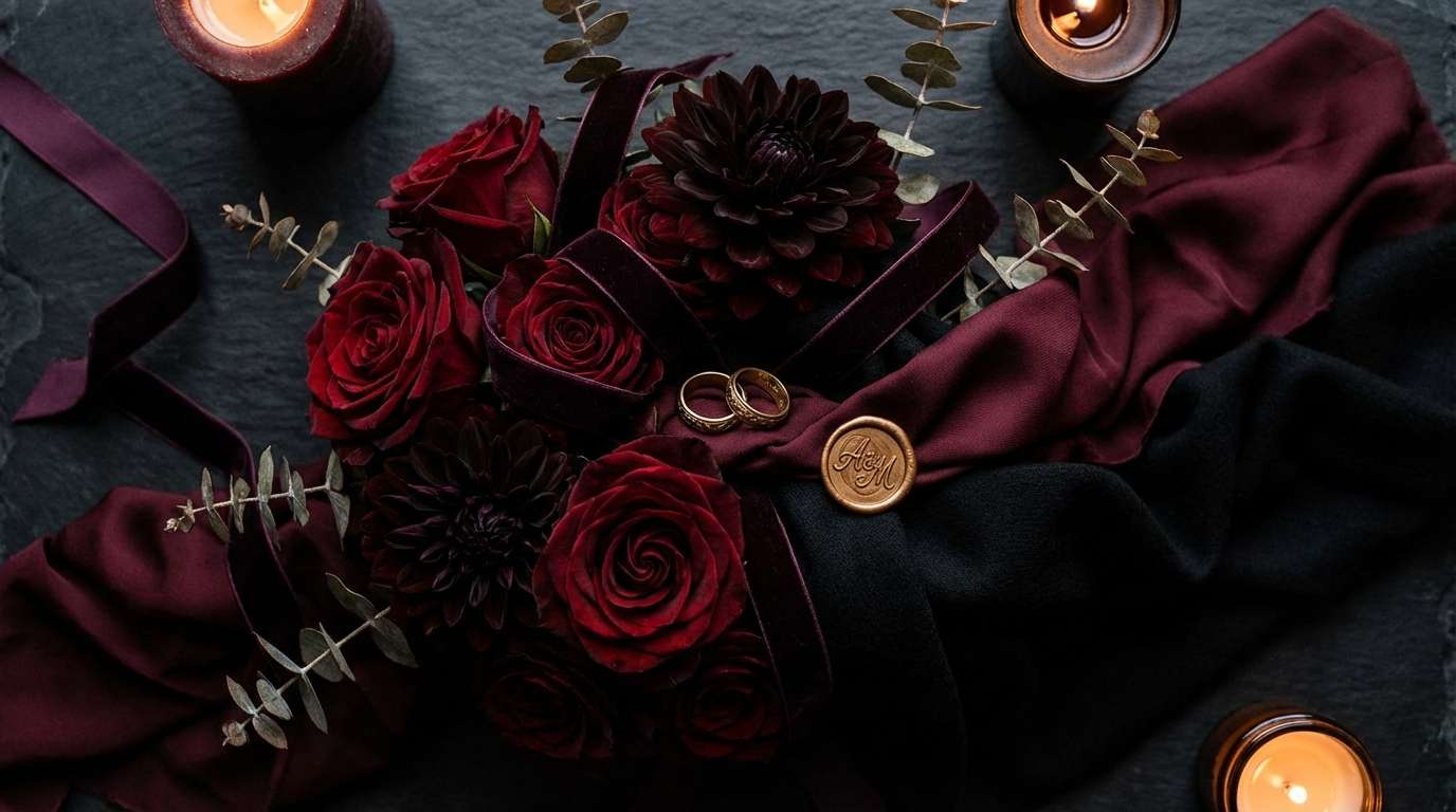
Plum noir wedding florals are their own small genre: flowers that bloom in the deep end of the plum-to-oxblood spectrum, textured enough to hold their color under dim reception lighting. Plum Noir rewards florals that match it in depth rather than contrast with it. The workhorses:
- Black Bacarra and Black Beauty roses: the darkest commercial roses, photographing almost liquid.
- Dark calla lilies: sculptural, stem-forward, oxblood-deep.
- Plum ranunculus and anemones: the fluttering core of a plum noir bouquet. Anemones with black centers are especially photogenic.
- Burgundy and Café au Lait dahlias: the dinner-plate showstoppers. Pair the darkest burgundy varieties with antique-gold Café au Lait for the palette’s full range in a single bloom.
- Deep plum scabiosa, purple orchids, plum stock, and dark hydrangea: the supporting cast for the lush, overgrown quality a plum noir tablescape needs.
- Smoke bush, chocolate cosmos, dark hellebores, split pomegranates, and trailing amaranth: finishing texture for the “garden gone feral after dark” look. A single trailing ivory bloom per bouquet keeps the eye moving; skip pastels and anything bright, since they will read as mistakes against this anchor.
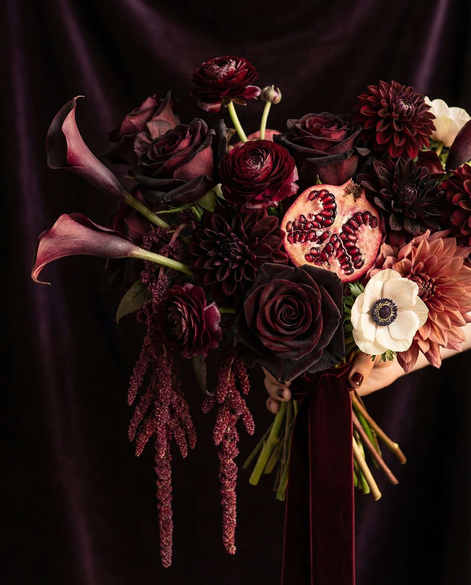
Seasonality matters. The deepest plum and oxblood blooms peak September through February. For a bloom-by-bloom reference, FiftyFlowers’ Plum Noir collection is one of the few floral catalogs using the Plum Noir name directly.
Plum Noir Tablescapes and Reception Décor
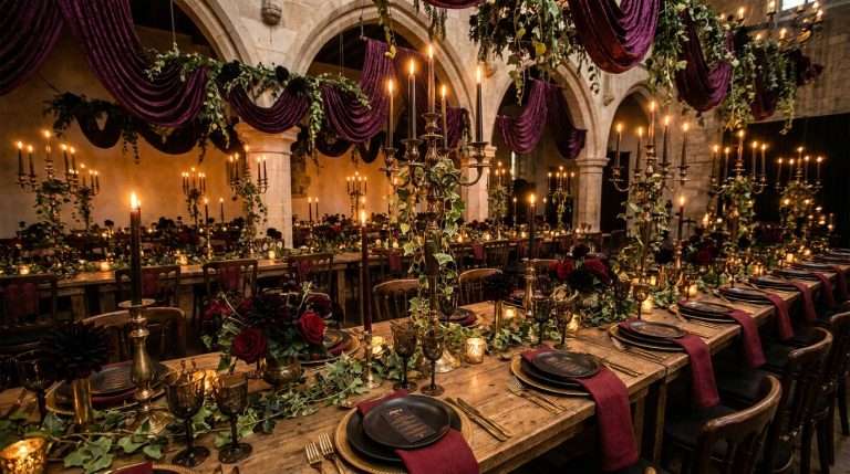
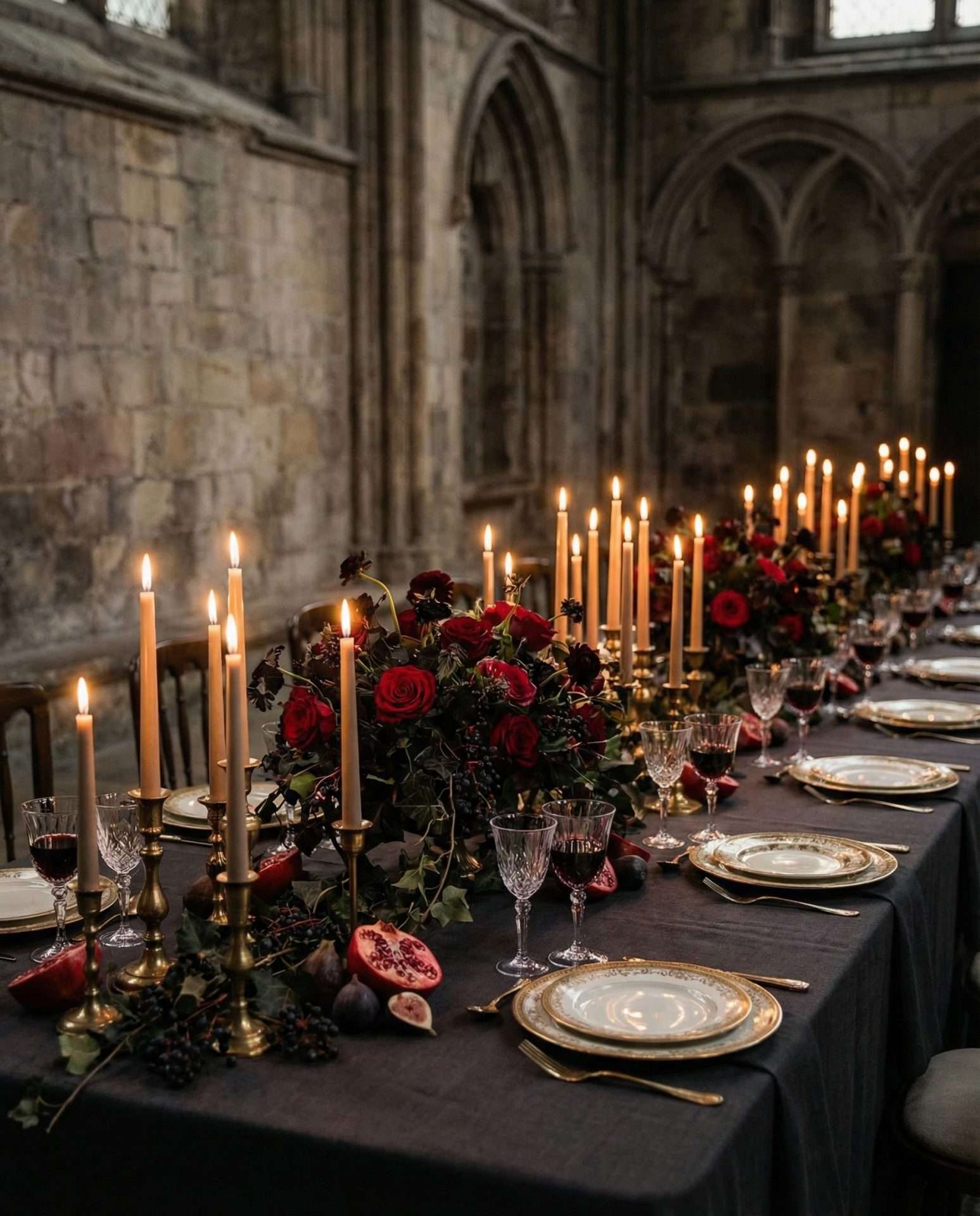
A plum noir tablescape should read, from across the room, as candlelit. Everything else, such as runners, glassware, and gilded flatware, is in service of warm, low, flickering light bouncing off surfaces that hold the dark.
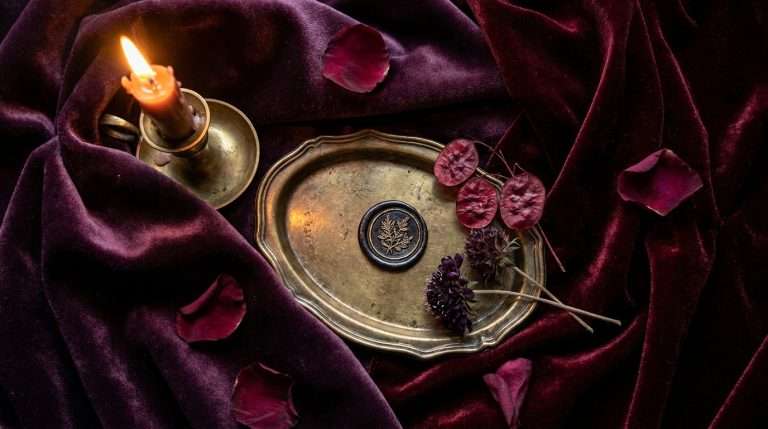
Start with a velvet or raw silk runner in Plum Noir laid over a charcoal or oxblood underlinen. Velvet and silk are the move. Velvet’s pile catches candlelight in exactly the way the color needs, and silk napkins in oxblood or deep wine photograph beautifully beside it. Avoid matte cottons and synthetics, which flatten the color and kill its depth. Resist the urge to layer in lighter shades. The power of the plum noir wedding tablescape is its density.
Build the centerline with hurricane lanterns, taper candles in antique gold holders, and dark florals in low, overgrown arrangements. Aim for twelve to fifteen candles per table. This is a palette that demands light, not decoration. Flatware should be antique gold, matte brass, or tarnished pewter. Never polished silver or chrome. Napkins in Plum Noir velvet or dusty mauve linen, tied with a length of oxblood silk ribbon.
⚠ Warm candlelight only: this is the single most important styling rule of the entire post.
Beeswax taper candles, warm incandescent bulbs, or candlelight-temperature LEDs at 2700K or warmer. Cool-white LEDs will destroy this palette. Plum Noir is engineered for the red-gold end of the light spectrum. Photograph it under fluorescent or cool-white light and it turns grey, flat, and sad. If you take one directive from this guide, take this one.
For signage such as menus, table numbers, guest book, and unplugged ceremony, our Enchanted Forest Day-Of Suite covers the full set, with each piece set for you by the studio. A plum noir wedding reception lives and dies on the consistency of its paper goods.
Plum Noir Wedding Stationery and Paper
Paper is where the plum noir wedding announces itself first. Before the guest sees a single candle, the save-the-date lands in their mailbox. In a palette this specific, the stationery is the first promise you make about the evening.
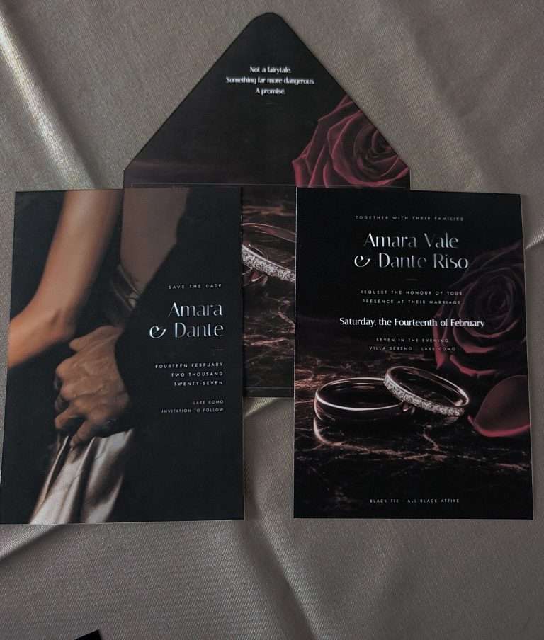
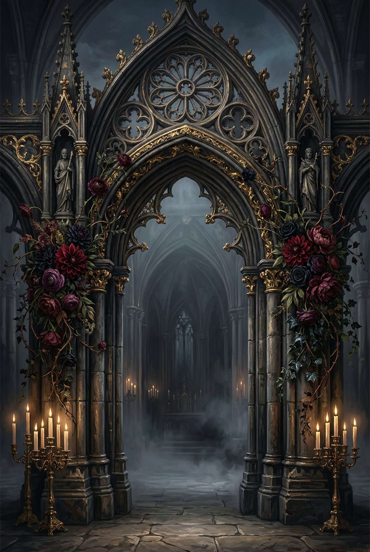
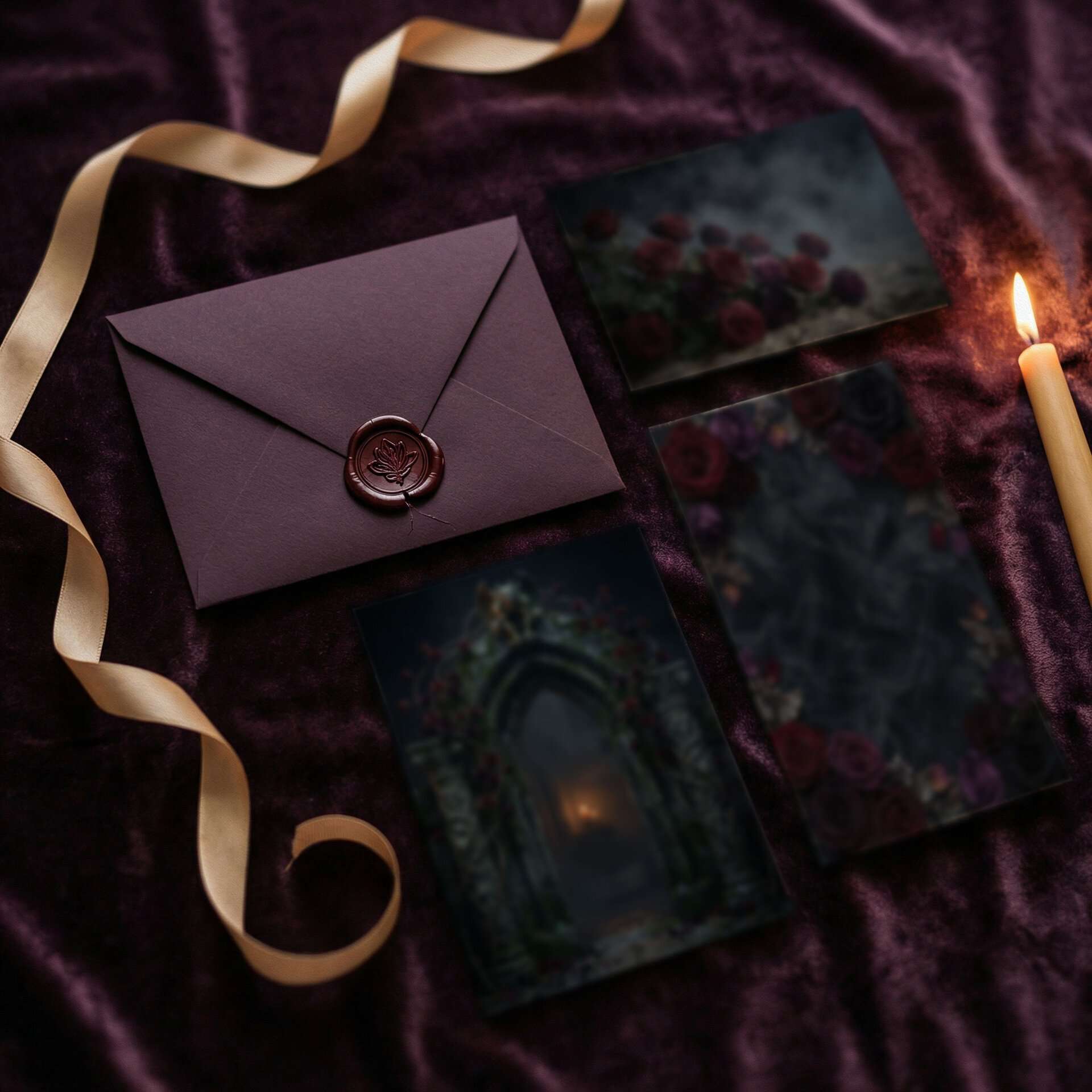
A plum noir wedding invitation suite should favor full-bleed artwork over white space. This is not a palette for minimalist cream cards with a sprig of greenery. The whole point of the color is that it is the scene, not the trim. The aesthetic wants you to drown the envelope in atmosphere: arched frames, rose borders, gothic cathedral lines, oxblood dahlias against Plum Noir backgrounds. Typography should lean into display serifs with high contrast and dramatic ligatures. A candlelight amber effect on matte Plum Noir stock is the material pairing the palette is begging for. Finish with oxblood wax seals. The difference between a real wax seal and a printed one is worth the extra minutes per envelope. If you are used to seeing wedding invitations as decorated cards, a full-bleed Plum Noir suite will look like a different category of object entirely.
ThornBloom Studio’s Dark Romance collection was designed around exactly this palette: Plum Noir #351E28, Oxblood #5C1A1B, and Candlelight Amber #C4956A, with full-bleed gothic-cathedral artwork tuned for the dark romantic aesthetic. The collection is live now.
Plum Noir Bridal Attire and Accessories
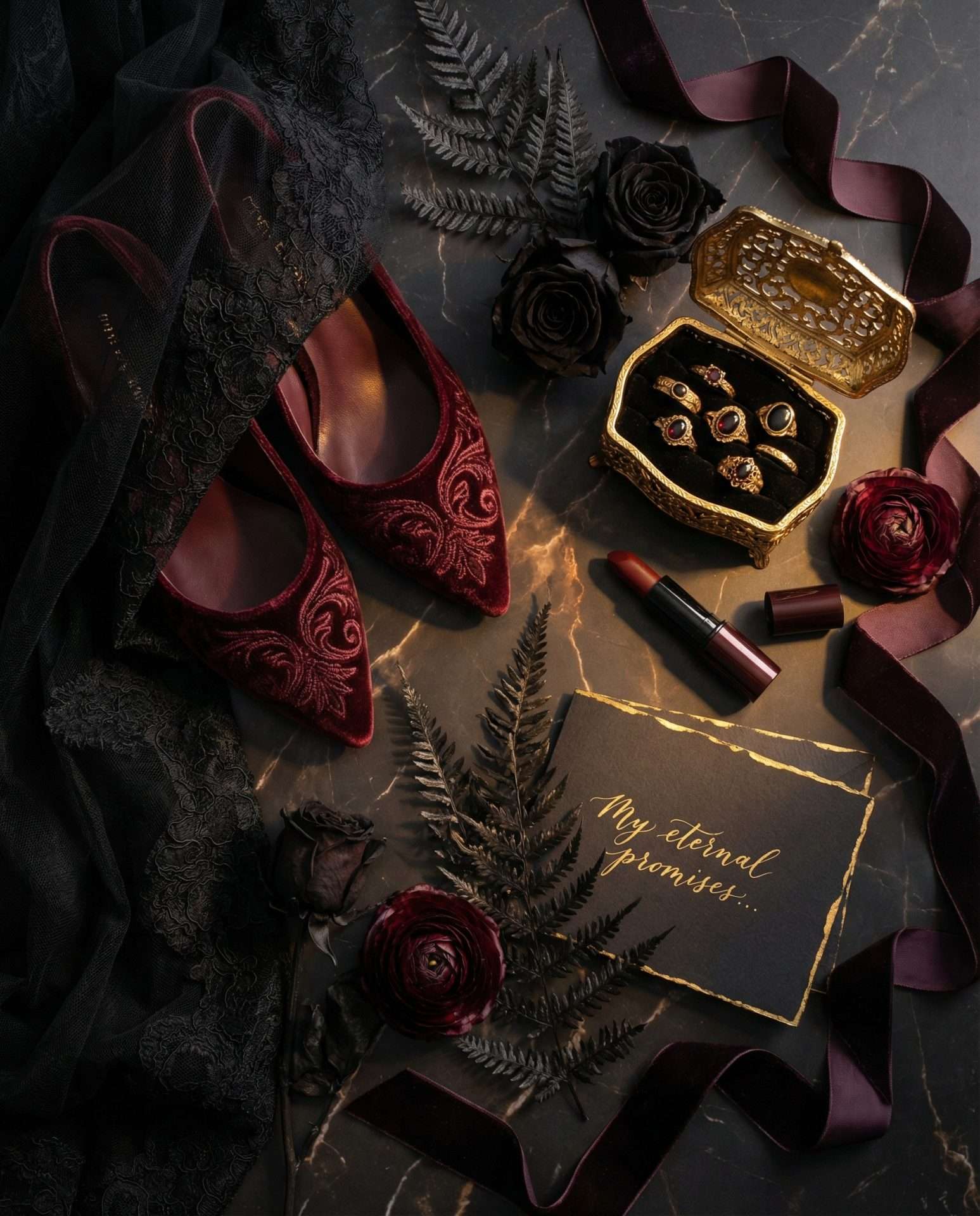
The plum noir wedding does not require the bride to wear plum. In fact, the most striking plum noir weddings pair an ivory or soft-champagne dress against the Plum Noir environment. The contrast is the point. Three dress directions work:
- Ivory with antique gold embroidery. The cleanest choice. Lean warm ivory, not cool white, so lace and beadwork pick up the gold tones of the room.
- Blush-plum or dusty mauve. A faint plum undertone ties the bride into the palette without burying her in it. Exceptional for garden and greenhouse plum noir weddings.
- True Plum Noir velvet or dark burgundy silk. The “I am the cathedral” option. Only for the right bride, but when it works, it is the entire moment.
Groom attire should lean plum noir or oxblood over charcoal over black. A velvet jacket with ivory shirt and oxblood pocket square is the most atmospheric choice. For bridesmaids, stay within the family: dusty mauve, oxblood, deep wine, slate plum. Avoid pure black. It flattens against a dark reception. Accessories should reach for antique gold: heirloom jewelry, gold-tone bouquet wraps, oxblood velvet hair ribbons.
Best Seasons and Venues for a Plum Noir Wedding
A plum noir wedding can happen in any season, but it rewards certain ones. Autumn (September through November) is the native season of this palette. Florals peak, daylight turns warmer and lower, venues lean into candle lighting, and guests arrive already dressed for the aesthetic. An October plum noir wedding is the platonic ideal. Winter is the runner-up, with candlelit receptions pairing beautifully with bare branches and evergreen garland. Late summer at dusk works if the reception is evening-first. Spring is the hardest season, with lighter florals and brighter natural light, but possible if you anchor the wedding indoors and commit to candlelight. High summer is the most challenging of all: long daylight hours fight the palette, and the florals Plum Noir loves are not at their peak.
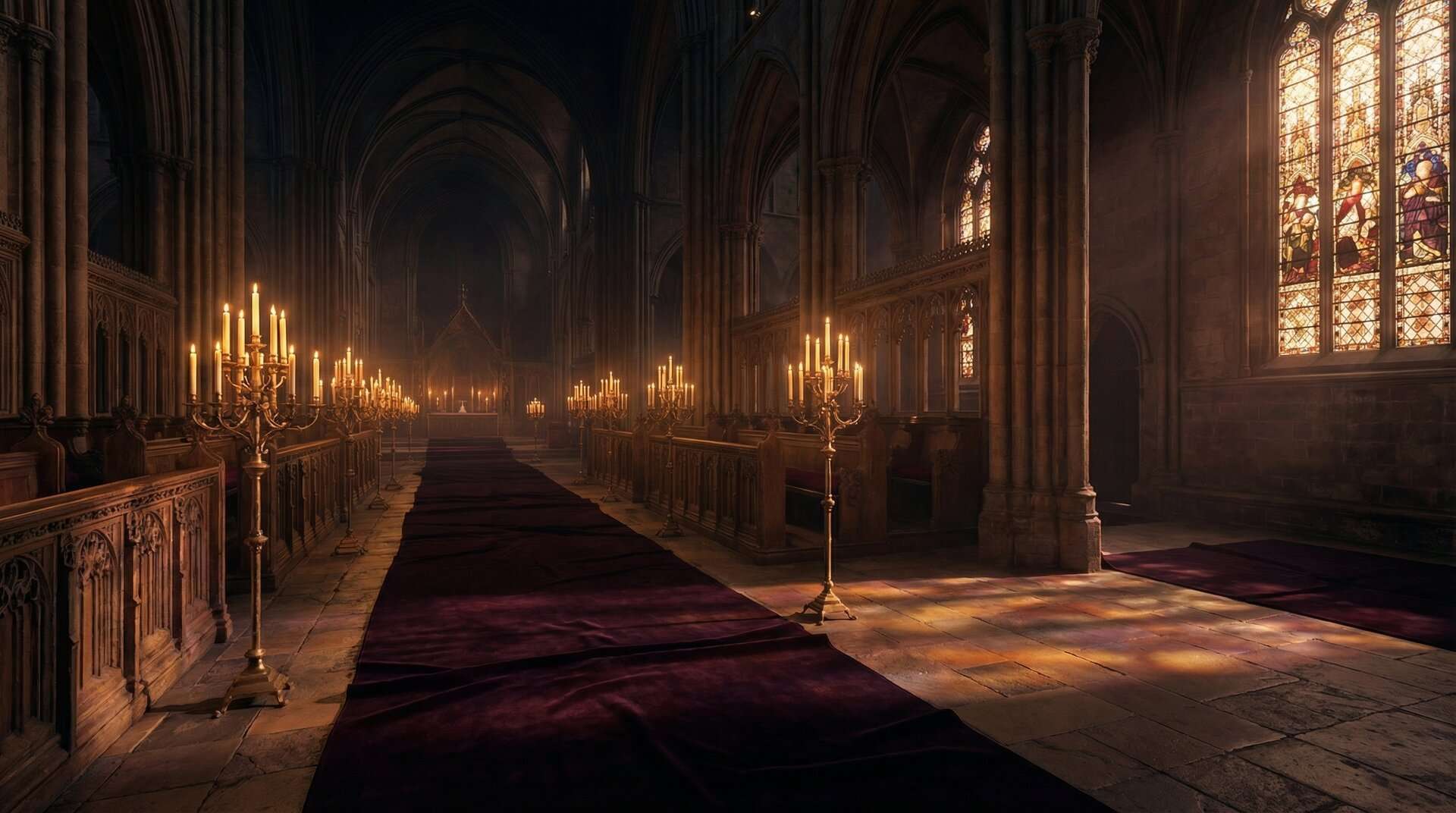
The venues that sing in a plum noir wedding all share one quality: they hold darkness beautifully. Flat white ballrooms fight this palette. Here is how the venue landscape breaks down:
Best venues:
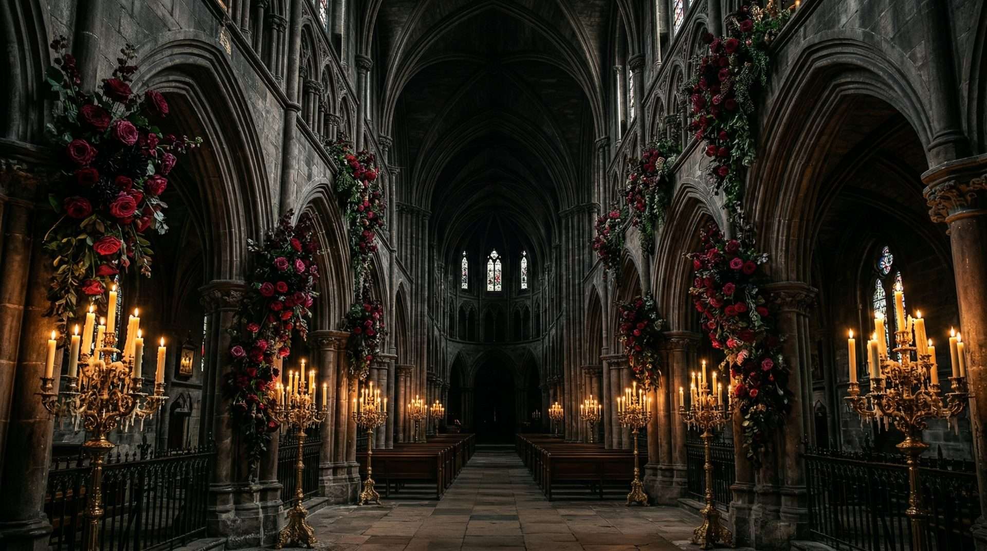
- Cathedrals and historic chapels: arches, stone, stained glass, and candlelight were made for this color.
- Castles and manor houses with original interiors: wood paneling, oil paintings, and chandeliers absorb and return the palette like nothing else.
- Conservatories and greenhouses after dark: glass structures at night become lantern-like, with candles multiplying in the panes.
- Libraries, museums, and historic clubs: dark wood, deep carpet, and existing gilt do half the styling work for you.
- Botanical gardens at twilight: works when the ceremony is late-afternoon and the reception transitions into a candlelit tent at full dark.
Acceptable venues: indoor barns with strong lighting control, hotel ballrooms with real dimmers, and converted churches. All workable, but you will need to bring your own candles and override the house lighting.
Difficult venues: beaches, open fields at midday, any daytime outdoor venue with harsh sun, white-tent receptions, and bright modern ballrooms with fluorescent lighting. The palette will fight you in all of these.
If you are still in the early inspiration stage, our broader guide to fantasy wedding color palettes and the sibling post on fall fantasy wedding color palettes place plum noir in the context of other ThornBloom aesthetics.
How to Build a Plum Noir Wedding Mood Board
A plum noir wedding mood board is not a Pinterest dump. It is a small, curated document that tells every vendor exactly what you want. Build it in this order:
- Anchor with the palette first. Pin
#351E28,#5C1A1B, and#C4956Aas labeled swatches at the top. Every other image must earn its place against these three colors. - Add two venue references: one interior, one exterior. Pick the shots that represent the exact light quality you want. Everything downstream cascades from how that room is lit.
- Add one bouquet and one centerpiece reference. One of each. This becomes your florist brief.
- Add one stationery reference. A single invitation suite image that captures paper weight, color depth, and typography mood. Your stationer brief.
- Add one bridal portrait and one wide-room shot. The portrait tells your photographer how you want to be lit. The wide shot sets the room style.
- Write three mood words underneath. Candlelit. Overgrown. Cathedral. Or whatever your three are. The words are the tie-breaker when you are torn between two directions later.
Nine images, three hex codes, three words, on a single screen. This outperforms a fifty-pin Pinterest board because it removes ambiguity. The vendor cannot misread it.
Plum Noir Wedding FAQ
What is Plum Noir?
Plum Noir is a deep, warm, wine-stained purple with the exact hex value #351E28. It reads burgundy in shadow, plum in middle light, and almost garnet under candlelight. Pinterest named it one of five defining palette colors in its 2026 Predicts report. It is distinct from eggplant (cooler, flatter) and from classic burgundy (skews true red).
Is plum a good wedding color?
Plum is an exceptional wedding color, especially for fall and winter weddings where the palette’s warmth reads fullest. It works across cathedrals, greenhouses, and manor houses, and photographs beautifully in candlelight. The key is to commit to a specific plum: Plum Noir at #351E28, rather than a vague “purple-ish” direction that vendors will each interpret differently.
What colors go with plum for a wedding?
Plum Noir is most striking paired with Oxblood (#5C1A1B) and Candlelight Amber (#C4956A): the classic three-color plum noir wedding palette. For softness, add ivory, blush-plum, or dusty mauve. Avoid bright jewel tones, pure white, and brassy yellow gold, which all fight the atmosphere. Deep wine and slate plum are the safest bridesmaid extensions.
What is the difference between plum and burgundy for a wedding?
Burgundy is a true red with a brown undertone: a bottle of Bordeaux. Plum Noir is a deep purple with a red pulse underneath: the fruit after it has ripened past red. Burgundy weddings read warmer and more traditional; plum noir weddings read cooler, darker, more gothic-romantic. The quick test: cozy cabin (burgundy) or candlelit cathedral (plum noir)? See our full Plum Noir vs. Burgundy vs. Oxblood comparison above for the three-way breakdown.
What flowers come in plum for wedding bouquets?
The best plum bouquet flowers are Black Bacarra and Black Beauty roses, dark calla lilies, plum ranunculus and anemones, burgundy dahlias, plum scabiosa, deep purple orchids, plum stock, dark hydrangea, chocolate cosmos, black hellebores, split pomegranates, trailing amaranth, and smoke bush for texture. Availability is strongest September through February. Florists can dye or ink-dip calla lilies and roses to extend the season.
What season is a plum wedding best for?
Plum is at its peak in fall (September through November) when natural light, florals, and guest wardrobes all align with the palette. Winter is a close second for candlelit indoor receptions. Late summer at dusk works if the wedding is evening-first. Spring is the most challenging, with brighter light and lighter blooms, but possible with an indoor venue and committed candlelight.
Can I have a Plum Noir wedding outdoors?
Yes, but timing and venue matter. The palette works best at dusk or indoors under candlelight. Outdoor ceremonies should be scheduled for late afternoon into golden hour, and receptions should be candlelit or held under cover where you can control the lighting. Midday sun in an open field will fight the palette. The saturation washes out, the warmth flattens, and the atmosphere disappears.
What does Plum Noir look like with gold?
Plum Noir with Candlelight Amber is the signature combination of the dark romance palette: what turns a plum wedding from “moody purple” to editorial. Use a warm bronze-amber tone like Candlelight Amber (#C4956A), never brassy yellow. The metallic belongs on flatware, candle holders, frame edges, and the metallic effect on stationery. In candlelight the effect is close to an old oil painting.
Is plum better than eggplant for a wedding?
Plum is the better term and the better actual color for almost every couple. “Eggplant” is what brides say when they cannot name the color they want, and it reads cool, flat, and dated in execution. Plum Noir is warm, dimensional, with a red undertone that glows in photographs. When briefing vendors, say plum noir and share the hex #351E28.
What venues suit a plum noir wedding?
The best plum noir wedding venues hold darkness beautifully: cathedrals and historic chapels, castles and manor houses, wood-paneled libraries and clubs, conservatories and greenhouses at night, and botanical gardens at twilight. Avoid flat white ballrooms and outdoor midday ceremonies. Both fight the palette. If the venue has candle chandeliers and dim available light, it is a plum noir venue.
Is Plum Noir good for a stationery suite?
Plum Noir is one of the best anchor colors for dark, full-bleed stationery. The depth gives the candlelight amber effect, ivory typography, and illustrated artwork somewhere to sit without competing. ThornBloom’s Dark Romance collection uses Plum Noir as the full-bleed background across every piece: invitation, save-the-date, menu, signage. So the suite reads as a single immersive scene rather than a set of decorated cards.
How do I build a Plum Noir wedding mood board?
Start with three labeled palette swatches: Plum Noir #351E28, Oxblood #5C1A1B, Candlelight Amber #C4956A. Add one interior and one exterior venue shot, one bouquet, one centerpiece, one stationery image, one bridal portrait, and one wide reception shot. Write three mood words underneath: candlelit, overgrown, cathedral. Send this to every vendor.
Shop the Dark Romance Collection
The plum noir wedding is, at its heart, a feeling: the warmth of a candlelit cathedral, the pulse of oxblood florals against velvet, the soft gold of an heirloom ring catching flame. It is a palette that rewards commitment and specificity, and one of the most atmospheric choices a couple can make for a 2026 wedding.
ThornBloom Studio’s Dark Romance collection is the stationery system we built for exactly this aesthetic: save-the-dates, invitations, RSVPs, menus, seating charts, and the full Grand Wedding Suite, all designed in the Plum Noir, Oxblood, and Candlelight Amber palette described in this post. The collection is live now, and every piece in it was built in the palette above.