Somewhere along the way, “fall wedding colors” became shorthand for burlap, pumpkin orange, and mason jars dangling from a barn beam. If that’s your aesthetic, wonderful. But it isn’t ours, and if you’ve landed here, it probably isn’t yours either. This guide is for the couple who wants autumn at its most cinematic: moss that seems to glow from within, plum deep enough to read as cathedral shadow, gold that flickers like a beeswax taper an hour past dusk.
These autumn palettes pair beautifully with a moody celebration u2014 see our dark fantasy wedding planning guide for complete inspiration.
Fall is, quietly, the most underrated season for a fantasy wedding. The light does half the work for you. The trees hand you a palette. The weather practically insists on candles, velvet, and something warm in a copper mug. If you’ve been browsing our broader guide to fantasy wedding color palettes and felt the autumn pull specifically, this post is the next step: four fall-specific palettes, styled for couples who want depth over cuteness and drama over decor trends.
No burlap. No mason jars. No sunflower yellow. Just the version of fall that looks like it belongs in a novel.

In This Article
Why Fall Belongs to Fantasy Weddings
Summer gives you too much light. Spring gives you pastels whether you want them or not. Winter is gorgeous but logistically punishing. Fall, though, hands you the exact atmospheric conditions a fantasy wedding needs for free. Long golden hours. Cool air that makes candles necessary instead of decorative. Foliage that turns your venue into a pre-built color story. Skies that photograph like oil paintings.
Most fall wedding content leans rustic because “rustic” was the dominant fall aesthetic of the last decade. But the couples we see planning for late 2026 and early 2027 are pulling in a different direction entirely: darker, richer, more literary. Cathedral over barn. Candlelit estate over open field. Dahlias over daisies. Fall’s natural palette lends itself beautifully to all of it. You just have to stop reaching for the orange crayon.
Three Rules for a Dark Fall Palette
The difference comes down to three choices:
- Layered darks, not bright accents. Rustic fall builds on cream and adds pumpkin. Fantasy fall builds on deep forest green, oxblood, or ink, then adds warm gold as the one light element.
- Warm metallics only. Antique gold, brushed bronze, burnished copper. No rose gold. No silver. No chrome. The warmth is what makes the dark colors feel candlelit instead of cold.
- Organic motifs, not craft-store motifs. Bare branches, moss, dahlias, berries, pomegranates, dried ferns. Anything that looks like it was gathered in a forest at twilight. Nothing that looks like it came in a bag labeled “fall decor.”
Keep those three rules and almost any fall palette will read as fantasy. Break them and you’ll drift toward the aesthetic you’re trying to escape.
Palette One: Dark Forest Green & Moss
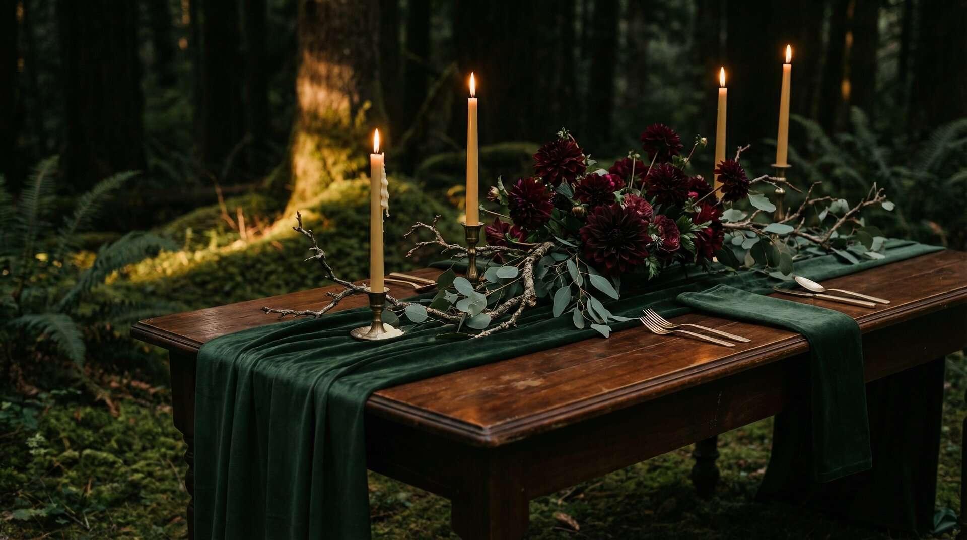
The core palette of our Enchanted Forest Reception Deluxe Suite, the ThornBloom set you can see in the photograph above, pulled into its most atmospheric fall expression. Invitation, Kindly Respond, Finer Points, Menu, QR code card, wax-sealed envelope, all rendered full-bleed in deep forest green with antique gold-effect typography. This is the palette for a candlelit reception under a canopy of bare branches, with ferns and taper candles running the length of every table, plus the Suite that lets the paper on the table read the same way.
Dark Forest Green
#1A2F25
Mossy Sage
#526A5E
Antique Gold
#D1B28C
Midnight Teal
#2C3E50
Candlelit Cream
#E8E1D5
Forest green is the anchor, not the accent. Layer it thick with velvet table runners, dense garlands of eucalyptus and fern, and emerald glassware, and let the midnight teal show up in the bridesmaids’ dresses or in folded linen napkins. Antique gold (#D1B28C) is your one source of warmth: flatware, candleholders, taper wax, the printed gold effect on the invitation suite. Cream only appears as relief in the place cards and the florals (white anemones with dark centers are perfect here). For more inspiration on pulling this palette together, our enchanted forest wedding stationery guide walks through florals, venues, and styling in more detail.
Palette Two: Plum Noir & Oxblood
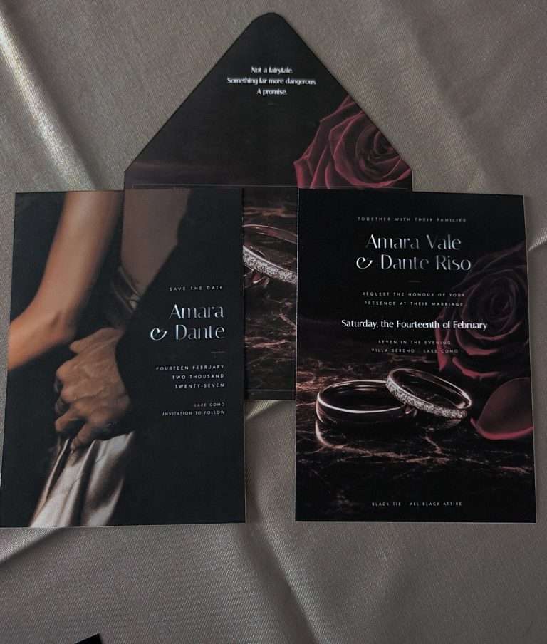
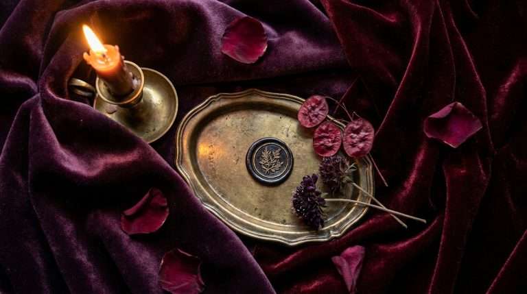
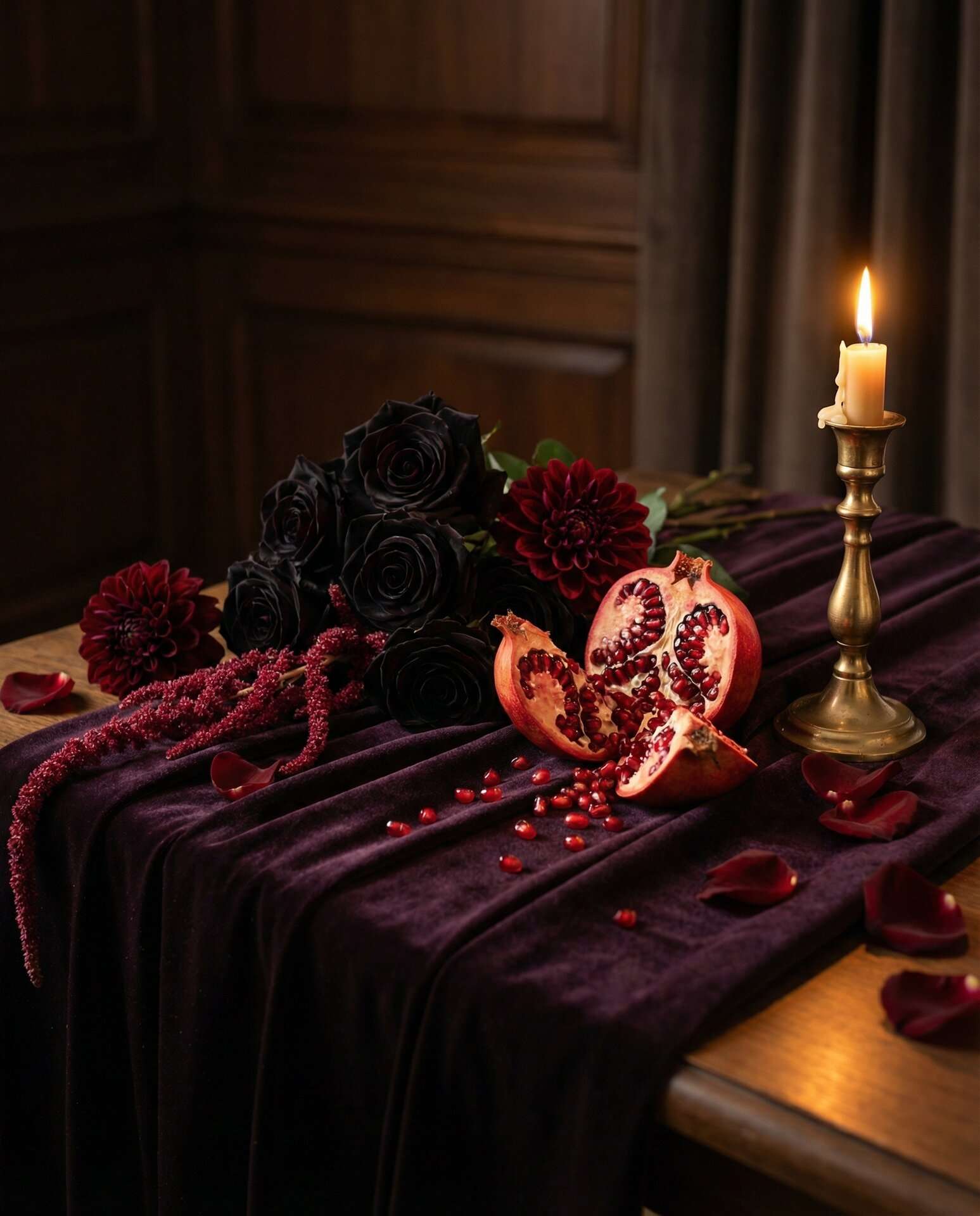
This is the palette for a couple who wants the drama of a gothic cathedral wedding without losing the warmth of fall. Plum Noir (#351E28) is a new, brand-owned shade we use as the anchor for our Dark Romance collection: deeper than burgundy, softer than black, moodier than either. In the low light of an October evening, it reads as cathedral stone lit by candles. And the photograph below shows how naturally it layers with what ThornBloom already sells: the live Enchanted Forest Suite: invitation, menu, QR card, plum envelope with wax seal, restyled onto a Plum Noir velvet ground with antique gold ribbon. Same shoppable Suite, completely different mood. Proof that moss greens and plum noir were always meant to share a table.
Plum Noir
#351E28
Oxblood
#5C1A1B
Antique Gold
#D1B28C
Deep Wine
#3B0A14
Warm Ivory
#F1E6D0
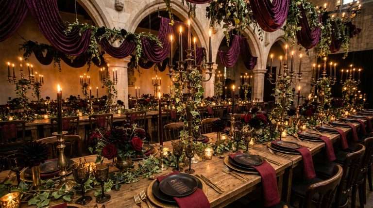
Florals should lean into fall at its richest: black baccara roses, dark dahlias, burgundy ranunculus, pomegranates split open, long trailing amaranth. Velvet linens in oxblood or plum. Flatware in antique gold. Lighting only from candles and warm incandescent bulbs. No cool LEDs, ever. This palette punishes fluorescent light. Treat the ivory as a breathing space: place cards, menus, the inner envelope of the invitation suite. Everything else wants to sit in shadow.
Palette Three: Smoked Amber & Obsidian
The “dark neutral” option. For couples who love the mood of the first two palettes but want something a touch more restrained: the fall-wedding equivalent of a black-tie dress code that happens to feel like a fantasy novel anyway.
Obsidian
#1A1A1A
Charcoal
#3C3631
Smoked Amber
#B8763A
Burnished Bronze
#8C6239
Warm Ivory
#F1E6D0
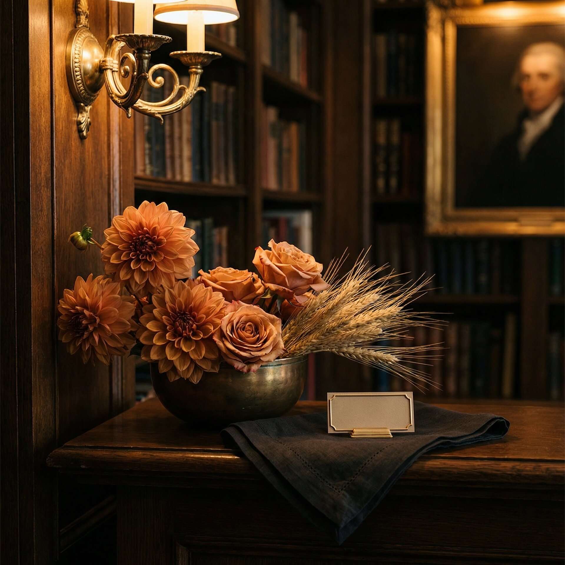
Think of this as the palette for a historic library wedding, or a late-October reception in a gallery with dark walls and picture lighting. Smoked amber is the hero. It’s what turns “black tie” into “fairytale.” Use it in the florals (copper dahlias, toffee roses, dried wheat), in the candlelight itself, and in the metallics. Obsidian and charcoal do the structural work: suits, table linens, menu cards. Warm ivory appears only where it has to: place cards, calligraphy, one trailing ribbon on the bouquet.
Palette Four: Oxblood & Ink (Cathedral)
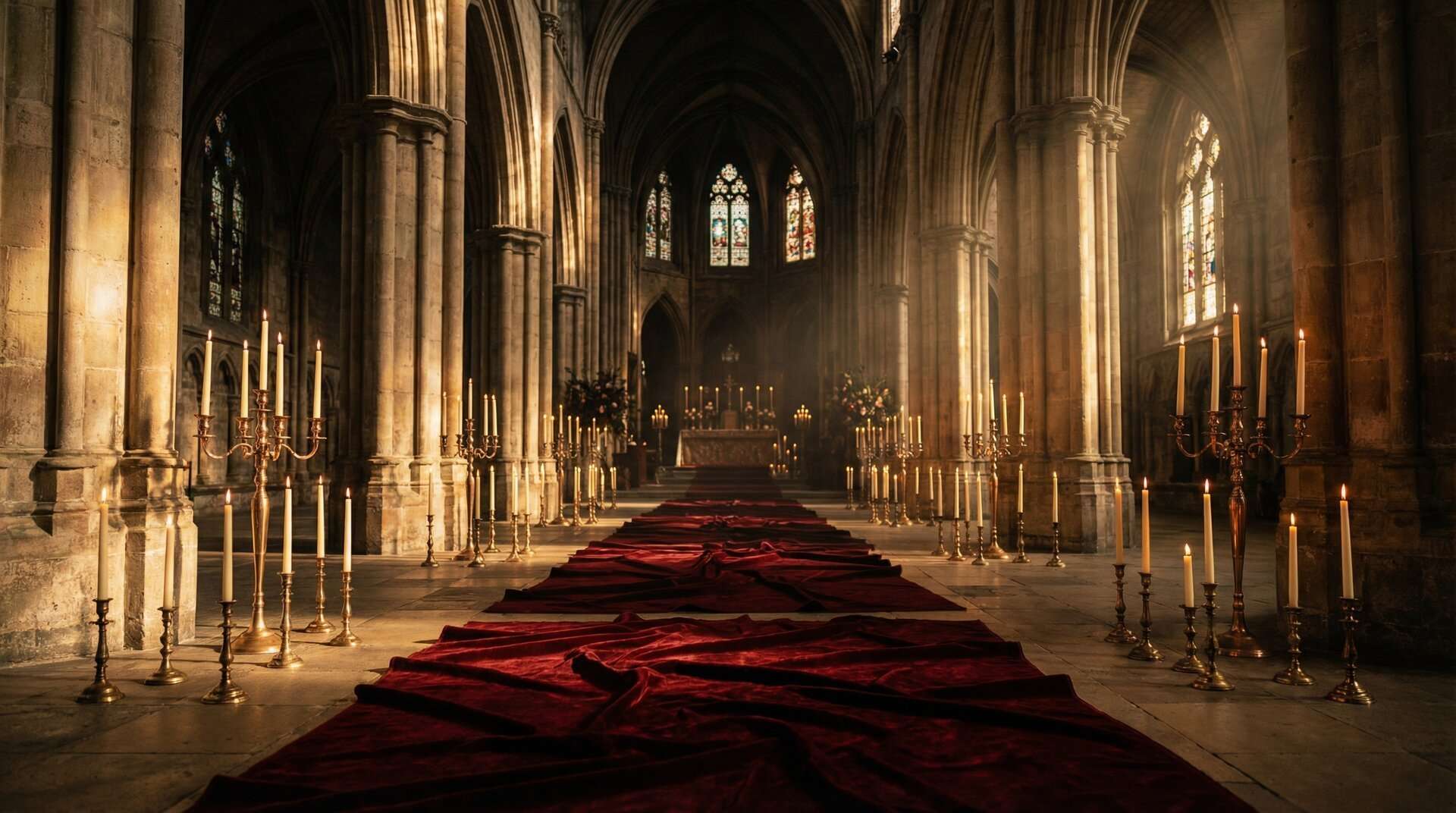
The cathedral palette. This is the one to reach for if your venue is a stone church, a historic estate with vaulted ceilings, or anything with stained glass. It’s the most dramatic of the four, and in fall, with early sunsets and natural candlelight, it hits hardest. For couples pulling from the broader gothic wedding aesthetic guide, this is where that mood lives most completely.
Oxblood
#5C1A1B
Ink Black
#0E0E0E
Candlelight Gold
#D1B28C
Deep Wine
#3B0A14
Candle Ivory
#E8E1D5
Oxblood is your color anchor. It should show up in the bridesmaids’ dresses, in the linens, and in the primary floral. Nothing else quite photographs like oxblood velvet does under candlelight. Ink black is the structural thread: groomsmen, menu headers, the envelopes on the invitation suite. Candlelight gold is non-negotiable: in the flatware, the wax seals, the printed gold effect on the stationery, and in the hundreds of taper candles this palette practically requires. If you’re considering this one alongside our broader coverage of moody wedding color palettes trending in 2026, know that this is the most wedding-traditional of the fantasy options and often the easiest sell to family who want something “classic” without compromising on drama.
Styling Rules: How to Wear a Dark Fall Palette
Once you’ve chosen a palette, the styling rules stay mostly the same. A few specifics:
- Florals: Dark dahlias (black cat, café au lait, cornel bronze), oxblood roses, burgundy ranunculus, dried wheat, bare branches, trailing amaranth, pomegranates, dried ferns, black baccara roses. Avoid anything pastel, anything sun-bleached, anything with visible pollen dust.
- Linens: Velvet if your venue allows it, heavy silk if it doesn’t. Runners in your darkest palette color. Napkins in either a deep accent color or the warm ivory. Never in white.
- Lighting: Beeswax taper candles in every possible holder. Warm incandescent or candlelight-temperature LED bulbs in fixtures. Absolutely no cool-white light anywhere in the reception. This is the single biggest variable that separates a fantasy fall wedding from an ordinary one.
- Stationery: Full-bleed, edge-to-edge artwork, never a small motif floating on a cream card. Your invitation should feel like an illustrated scene from a novel, with the text set into the atmosphere rather than stamped on top of it. Every ThornBloom suite is designed this way, which is why full-bleed dark stationery is our entire philosophy. The Enchanted Forest Reception Deluxe Suite is the reference for how full-bleed reception stationery reads on the table.
- Printing: We’re a done-for-you digital stationery studio, so every piece is set for you and delivered as a print-ready file. Most pieces can also be printed and shipped through the studio’s printing partners. Email info@thornbloomstudio.com for a quote.
Frequently Asked Questions
How much dark green is too much for a fall wedding?
Not at all. Fall’s natural light makes dark greens look richer, not heavier. Deep forest green photographs beautifully under candlelight and against autumn foliage. The trick is to pair it with a warm metallic (gold or bronze) and a single light relief color (cream or ivory) so the palette breathes.
Can you skip orange entirely in a fall wedding palette?
Absolutely, and many of the most striking fantasy fall weddings we see skip orange entirely. Replace it with smoked amber, burnished copper, or deep oxblood for warmth, and let your metallics (antique gold, bronze) carry the autumn feeling. The result reads more editorial and more intentional than a traditional orange-and-rust palette.
What florals work with a dark fall fantasy palette?
Black baccara roses, dark dahlias (especially black cat and café au lait), burgundy ranunculus, trailing amaranth, dried wheat, bare branches, pomegranates, dried ferns, and eucalyptus. Avoid anything traditionally “fall cheerful,” such as sunflowers, bright marigolds, or pastel mums, which will fight the palette instead of supporting it.
Does full-bleed stationery work for a dark fall wedding?
Look for full-bleed, edge-to-edge artwork in your palette’s anchor color rather than decorated text on cream paper. Our Enchanted Forest and Dark Romance suites are both built this way. Every invitation, menu, and sign is an immersive illustrated scene in the exact palette range covered in this post.
Bring Your Fall Fantasy to Life
Every palette in this post is already rendered, full-bleed, across a complete wedding stationery suite. Browse the enchanted forest wedding stationery for Palette 1, or the Dark Romance collection for Palettes 2 and 4. And if you’d like a planning tool that travels with your palette from the save the date to the last table number, our free Wedding Planner Bundle (three formats, yours free) is built in the same dark luxury aesthetic. Your planning documents look as intentional as your wedding does.
Pair your fall palette with stunning paper goods using our fairytale stationery tips.
Love the darker end of autumn tones? Dive into our plum noir wedding guide for a moody, romantic color story.