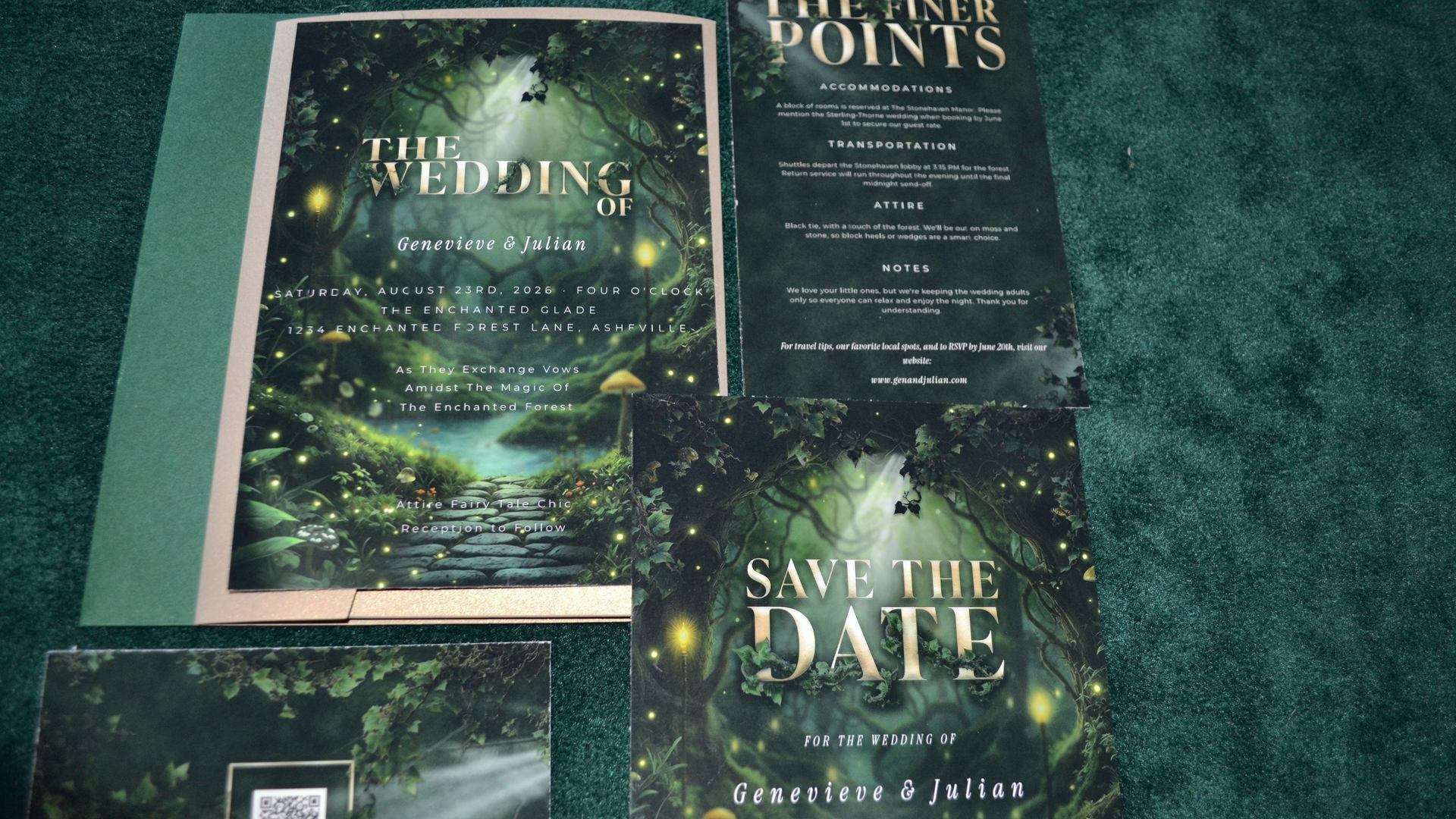
You have found the suite. The artwork is exactly right (full-bleed, low-lit, gold catching against a dark ground) and every piece matches the one before it. Then comes the only question that actually remains: how do your names get onto it, and who does that work?
At ThornBloom Studio, we do. You send us your details, the studio sets every piece, I check them, and print-perfect files come back to you once you have approved a proof. There is no software involved on your side and nothing to learn. This post is about why the studio works that way. It is not an accident, and it is not laziness on your behalf. It is the only way I have found to make full-bleed illustrated stationery survive contact with real names, real venues and real print.
This is part of our Complete Guide to Dark Fantasy Wedding Stationery, which covers choosing, personalizing and printing luxury wedding stationery end to end.
In This Article
Why the Words Cannot Simply Be Dropped In
Most wedding stationery is decorated text. There is a border, or a floral corner, or a wash of colour, and the words sit in the safe empty middle. Move a line and nothing happens, because there is nothing underneath it.

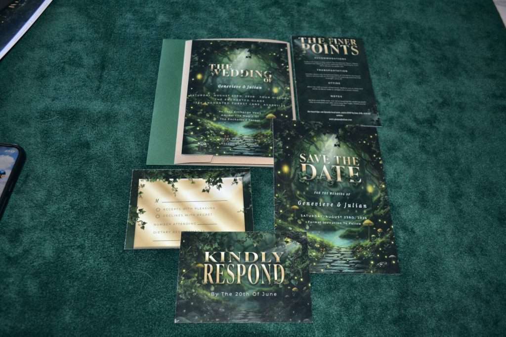
ThornBloom suites are not built that way. The illustration runs edge to edge and the type sits inside the scene: a name crosses a shaft of moonlight, a date lands on the darkest part of the stone, a line of vows threads between two trunks. Every one of those positions is a decision, and every one of them is wrong two millimetres in any direction. That is the difference between a suite that looks commissioned and one that looks filled in.
Then there is the problem no design system solves on its own: names are not the same length. A five-syllable surname and a one-syllable surname do not balance the same way against the same illustration. A venue called The Old Chapel and a venue called The Chapel of Saint Cuthbert on the Moor need different line breaks, different sizing, and sometimes a different arrangement of the whole block. Neither is harder than the other. They are just different problems, and they get solved one couple at a time.
From the Studio
The single most common thing I adjust is the point at which a long name is allowed to break, not a colour or a font. Set the break in the wrong place and a beautiful invitation reads awkwardly for reasons nobody can name; they just feel it. I have set these layouts against a very wide range of name and venue lengths, so when yours arrives the design already knows where it wants to sit. And if it does not, I move it before you ever see it.
Why the Palette Is Set
Every colour in a ThornBloom suite is chosen against the artwork and then calibrated for print, and it does not change. This is the decision couples ask about most, so here is the honest reasoning.
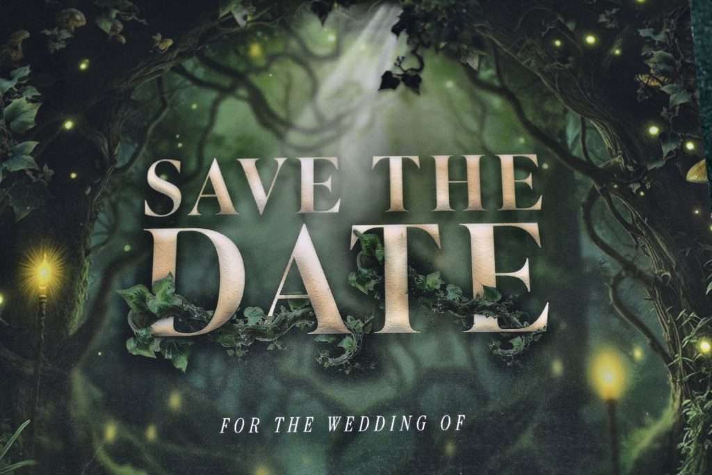
Dark, saturated designs are the least forgiving thing you can put on paper. A deep green that glows on a backlit screen can go flat and muddy on matte card. Gold is worse. It is not a colour so much as a relationship between a warm tone and the darkness around it, and shifting either side of that relationship by a little turns it brassy or turns it dull. The palettes in these suites sit where they sit because that is where they survive the journey from screen to ink.
So the palette is not locked to protect the design from you. It is locked to protect the printed result, which is the only version that matters and the only version your guests ever see.
Four Steps, Start to Finish
ThornBloom Studio
Four Steps, Start to Finish
From choosing your suite to printed cards
Step 1
Choose
Your Collection and Suite
Step 2
Send
Your Details and Wording
Step 3
We Set It
Proofed, Then You Approve
Step 4
Home, Local or Partner
Print Anywhere
Standard Trim Sizes
Print-Perfect
300 DPI, Bleed and Trim
Proofed by a Person
Before Anything Is Final
Step 2 is the whole of your technical involvement: names as you want them printed, date and time, venue, RSVP details, dress code if you are setting one, and your menu for the menu pieces. If you are not sure how to word something (and almost nobody is sure about invitation wording the first time), describe the situation and we will set it properly.
For the full walk through each stage, including what happens with the pieces that depend on a guest list, see how your stationery is personalized and printed.
What the Studio Sets, and What Stays Exactly as Designed
We set every word in your suite (names, dates, venue, times, RSVP details, menu items, sign copy, table labels), along with the typography that carries them: sizing, spacing, line breaks and the balance of each block against the illustration behind it. We keep the suite internally consistent, so the RSVP deadline on your details card and the one on your RSVP card cannot disagree. And before any of it reaches you, a person reads it.
What stays exactly as designed is the artwork itself, the palette, the typeface pairings and the trim sizes. The full-bleed illustrations, the metallic effects and the decorative elements are the product. I have spent a long time on every visual detail, and holding those fixed is what carries that polish through to the printed piece in your hand.
That is the trade, stated plainly: you give up moving things yourself, and in exchange the thing you receive looks like the thing you fell for.
One Piece Drawn by Hand
There is a single exception worth naming, because it is genuinely different from everything else. The vellum wrap is hand-drawn, a fine gold vine, drawn on a drawing pad, printed on translucent vellum and folded around the invitation. It is deliberately simple: vellum is unforgiving, and a fine line drawn in gold is the thing it does beautifully.
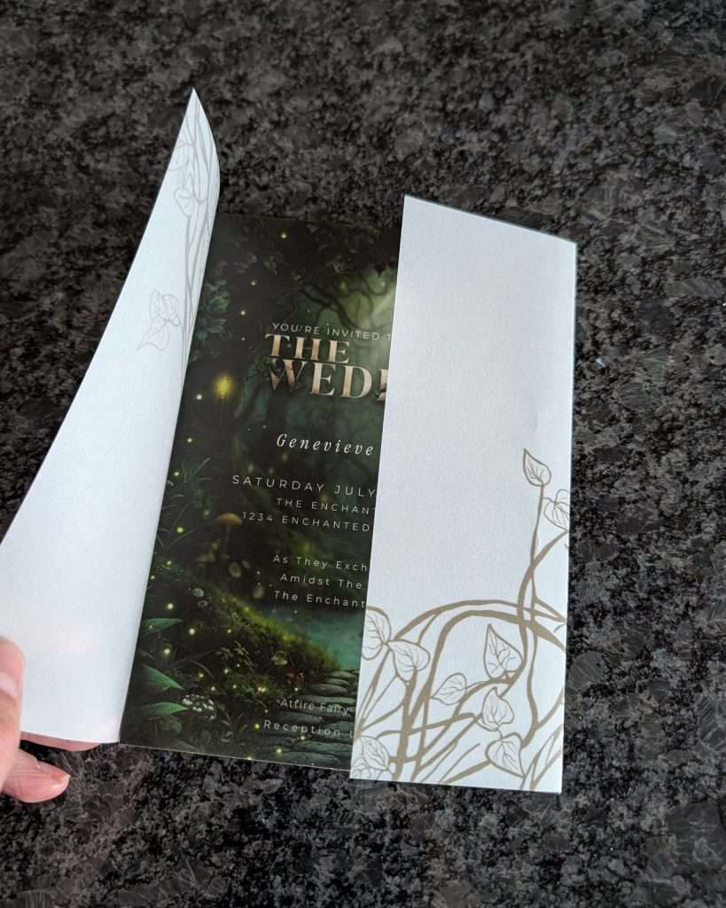
Everything else in the catalogue is a designed and composed piece rather than a drawn one, and I would rather tell you exactly which is which than let one word cover both.
What a Proof Is Actually For
Everything above is about getting the design right. The proof is about getting your details right, and it exists because stationery errors are permanent in a way that almost no other wedding error is.
A typo in a spreadsheet gets corrected. A typo on 120 printed invitations is 120 printed invitations. It has already gone in the envelopes, or it has already gone in the post, and no amount of goodwill undoes it. That single asymmetry is the reason nothing here is ever finalized quietly.
So before anything is final, you see every piece exactly as it will print, and you check the things only you can check: your own surnames, the RSVP date against your calendar, the venue address guests will actually put into a map.
Your proof arrives within 2 business days of us receiving that stage’s details, since the clock starts when your wording reaches us, not on the day you order. Two rounds of revisions are included per stage. Need more than that? Reply to your proof and we’ll talk it through. If the proof does not match what you sent us, that is our error, and we fix it free however many rounds it takes.
Your suite is set in stages, because a wedding happens in stages: save-the-dates, the invitation suite, day-of details, guest list and seating, thank-yous. You send each stage’s details when you have them. The seating pieces (place cards, the seating chart, and food labels when they are labelled per guest) wait on a final guest list, so that stage runs to 3 business days and includes two rounds of revision instead of one, because late RSVPs are universal. There is no deadline for sending any of it. Table numbers do not wait on a guest list; they need only your table count.
If You Would Rather Set It Up Yourself
Some couples genuinely enjoy this part. They want to sit with the file, try six versions, and own every decision. That is a real preference, and there is nothing lesser about it. It is simply a different job from the one this studio does.
Everything on thornbloomstudio.com is done-for-you. If you are weighing the two models against each other, our guide to done-for-you or self-serve lays out both sides properly.
Frequently Asked Questions
Do I have to lay out my own wedding stationery?
No. ThornBloom is a done-for-you studio. You send your details, the studio sets every piece and sets the typography against the artwork, a person proofs it, and print-perfect files come back to you. There is nothing to install and nothing to learn.
Can the artwork or the colours be changed?
No, and that is deliberate. The illustrated scene is the product, and every colour in it is calibrated to reproduce properly in print. Dark, saturated designs are the least forgiving thing you can put on paper, and altering the palette is the fastest way to lose the depth that made the design worth having.
What files do I receive?
Printed pieces arrive as PDFs at 300 DPI with bleed and trim marks. Mobile pieces arrive as image files sized for phone screens and messaging apps. The files are yours to keep.
How long until I see a proof?
Your proof arrives within 2 business days of us receiving that stage’s details, since the clock starts when your wording reaches us, not on your order date. Guest List and Seating runs to 3 business days and includes two rounds of revision rather than one. There is no deadline for sending any stage’s details; we accept them whenever you are ready.
Where to Start
Two collections are open. Enchanted Forest is moss, firelight and gilded green; Dark Romance is cathedral shadow in oxblood and plum. Midnight Celestial is opening next. The Enchanted Forest Essentials Suite at $79.99 is the usual place to begin.
When your files arrive, most pieces can also be printed and shipped through the studio’s printing partners, by quote. Email info@thornbloomstudio.com with the pieces you would like, rough quantities, your wedding date and your destination.
Still deciding how to send your stationery at all? Read our guide to digital vs. printed wedding invitations, or see How It Works for the whole process on one page.
Ready to Choose Your Collection?
Browse the collections, and take our free wedding planner with you: a Google Sheets tracker, a Notion board and a printable checklist.