Two invitations can carry the exact same design and still feel completely different in the hand. The difference usually comes down to two things: the weight of the paper and the finish on top of it. Neither one is complicated once you know what each option actually does, and knowing the basics means you can ask for exactly what you want when it’s time to request a printed quote.
This guide covers wedding invitation paper weight and finish in general terms: the common options, how they change the way a design reads, and what to think about if your suite leans dark and moody. It’s background, not a spec sheet. Printers vary in what they stock, so treat this as vocabulary to have on hand, not a list of what any one studio carries.
In This Article
Why Paper and Finish Change How a Design Reads
An invitation is a physical object before it’s anything else. Guests hold it, turn it over, run a thumb across it, and that impression happens before a single word gets read.
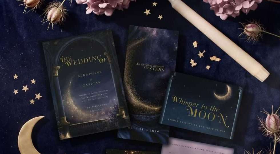
Finish affects how light behaves on the surface. Matte absorbs light and reads as quiet and understated. Glossy or pearlescent finishes reflect it, adding shimmer. The same artwork can look restrained on one finish and dramatic on another, purely because of how the surface catches light. Weight affects something different: how substantial a piece feels when it’s picked up. Neither choice is right or wrong. They’re tools, and the best one depends on the mood you’re going for.
Weight, in General Terms
Paper weight is usually described in pounds or as a cardstock category, a rough guide to thickness rather than an exact science, since mills measure it differently. Broadly, wedding stationery falls into a few bands:
- Lighter cardstock feels closer to a greeting card, and works well for enclosures like details cards or reception inserts.
- Mid-weight cardstock is the common choice for a main invitation, enough body to feel intentional without becoming stiff or bulky.
- Heavier cardstock feels substantial in hand, often chosen as the centerpiece of a suite, though it can add bulk and affect mailing costs.
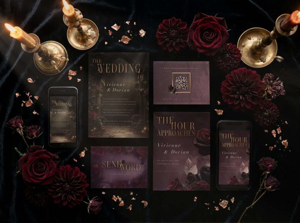
Weight is a preference, not a rule. Some couples want one consistent weight across the suite. Others use a heavier stock for the invitation and lighter stock for enclosures, so the main piece stands out first.
Finish Types, in General Terms
Finish is the surface treatment on the paper, and it’s often where couples notice the biggest difference in feel. A few common options:
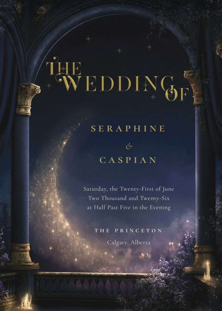
Matte has a flat, non-reflective surface. It reads as understated and elegant, keeps fine detail crisp, and doesn’t fight with a design’s colors under different lighting. A dependable, versatile default.
Soft touch (sometimes called suede or velvet finish) has a slightly textured, matte surface with a soft feel under the fingers, often described as a premium upgrade from standard matte. It tends to make dark, saturated colors look especially rich, since the texture diffuses light rather than reflecting it sharply.
Pearlescent (or shimmer) finishes have a subtle sheen that shifts as the card catches light, adding movement and glamour, though it can make small, dense text harder to read against a busy background.
Other finishes exist too, from linen textures to high gloss. The point isn’t memorizing every option. It’s knowing that “paper” is really two decisions, weight and finish, chosen together.
How Metallic-Effect Artwork Prints Differently by Finish
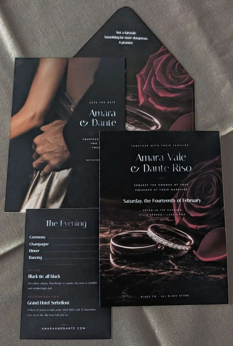
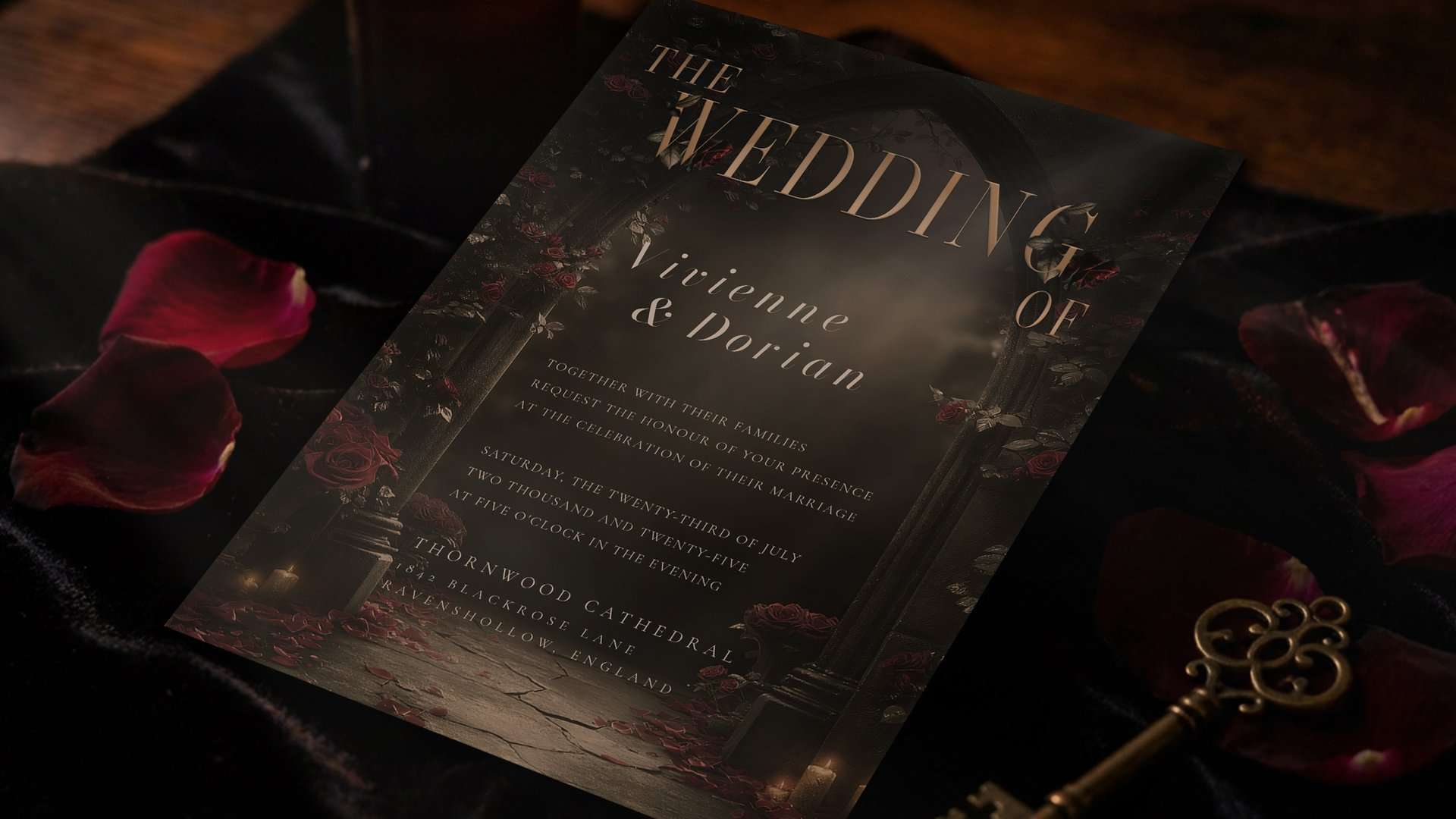
ThornBloom’s designs often carry a printed metallic effect: gold, silver, or amber-toned detailing built directly into the artwork rather than applied as a separate element. Because that metallic look is printed ink, the finish underneath it plays a real role in how it reads.
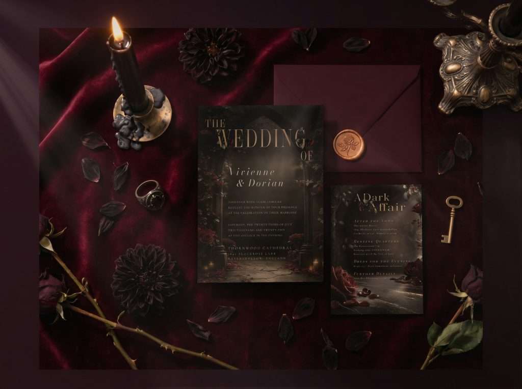
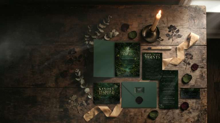
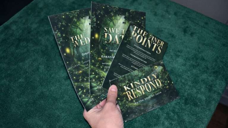
On matte, a printed metallic effect stays soft and refined, a warm highlight rather than a bright shine, suited to a quieter aesthetic. On soft touch, dark backgrounds tend to look especially rich and velvety, and a printed metallic effect can sit beautifully against that depth, which is why couples with dark, gothic, or celestial palettes often gravitate here. On pearlescent, the sheen of the paper itself can compete with a printed metallic effect, so it’s worth mentioning when you email for a quote if you want the metallic detailing to stand out clearly.
There’s no universal answer, since it depends on the specific artwork and the depth of the background color. As a general rule, darker palettes with fine metallic-effect detailing often read best on a finish that adds richness without competing shine.
What to Ask For When You Request a Quote
You don’t need to become a paper expert before requesting a printed quote, just the vocabulary to describe what you’re picturing. When you’re ready to explore printed and shipped options, it helps to have ready:
- Which finish appeals to you, if you have a preference already (matte, soft touch, pearlescent, or something else you’ve seen and liked)
- Whether you want a heavier or lighter feel for your main invitation versus your enclosures
- Which pieces in your suite you’re most focused on getting right, since finish often matters most on the piece guests see first
From there, the studio’s printing partners can walk you through what’s suited to your design and palette. ThornBloom’s printed and shipped service is arranged by quote only and ships to the United States and Canada. Files remain available for digital delivery in every case, so printing is never required.
To ask about paper and finish options, email info@thornbloomstudio.com with your collection, suite or pieces, and your wedding date and destination. The studio will follow up with a quote and can talk through finish and weight at that stage.
If you’re still choosing a collection, the Dark Romance collection and the Midnight Celestial collection are both good places to see how dark, atmospheric artwork and printed metallic-effect detailing come together. For a broader look at the done-for-you process, visit how it works.
FAQ
Does finish change the price?
Printed and shipped orders are arranged by quote, and finish is one of several factors a printer may factor into that quote. There’s no fixed answer here since it depends on the printer and the specific finish requested, which is exactly why finish is worth mentioning when you email for a quote.
Can I choose finish for a printed-and-shipped order?
Yes. When you email info@thornbloomstudio.com to request a printed and shipped quote, you can ask about paper and finish options as part of that conversation. Include your collection or suite, rough quantities, wedding date, and destination, and the studio will follow up with details.
What finish suits a dark-toned design best, in general?
There’s no single right answer, but as a general rule, richer, more saturated backgrounds often pair well with a finish that adds depth and texture rather than competing shine, since that combination tends to let printed metallic-effect detailing stand out clearly. It’s worth mentioning your specific design when you email for a quote, to see what the studio would recommend.