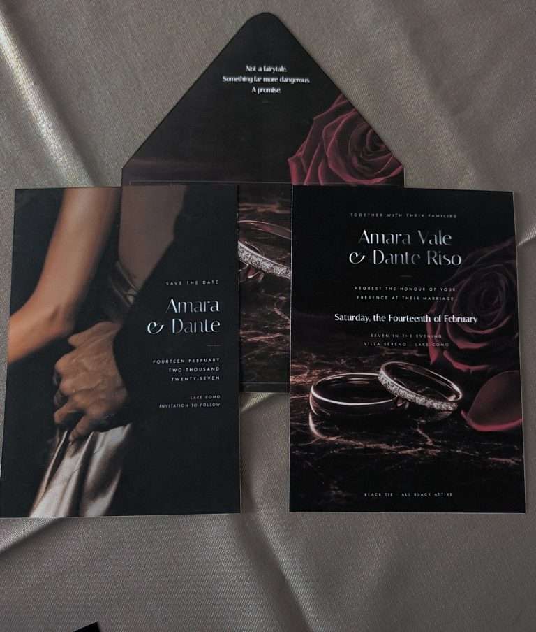
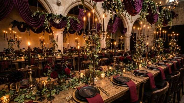
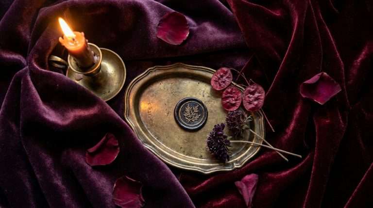
There is a particular alchemy that happens when oxblood meets candlelight. The warmth deepens, the shadows soften, and every surface in the room begins to glow as though lit from within. If you have been drawn to the dark romance wedding aesthetic, building the right color palette is the single most important decision you will make: more than the venue, more than the florals, more than the gown. Color is the atmosphere itself.
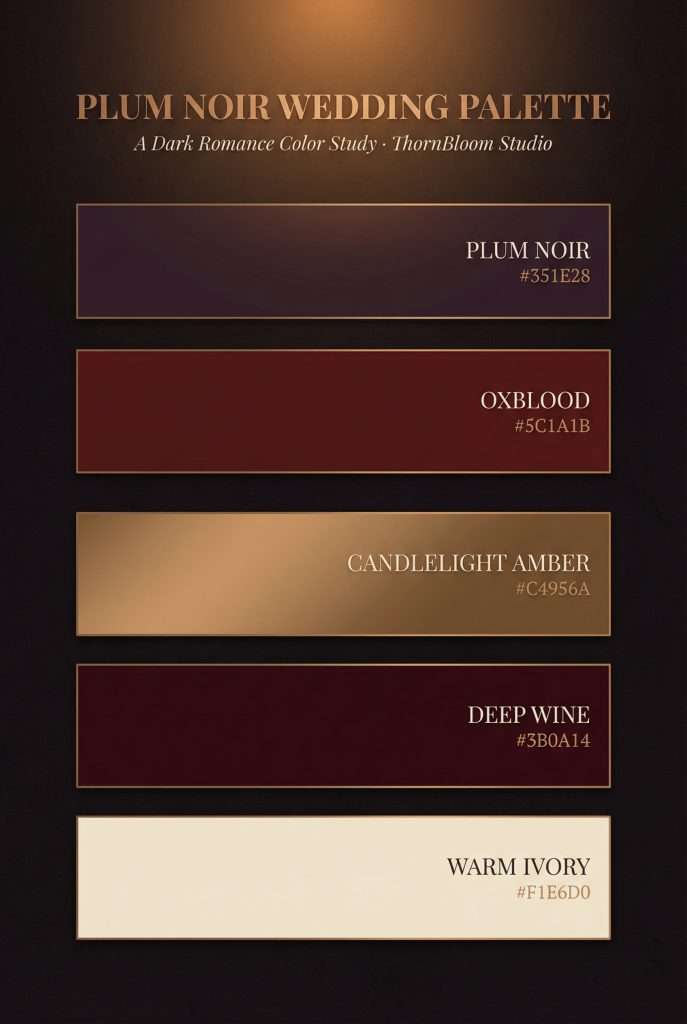
This is the exact palette behind ThornBloom Studio’s Dark Romance collection: three core tones, three supporting shades, and the precise hex codes you can hand to every vendor on your list.
In This Article
The Three Core Colors
Every dark romance palette starts with a triad: a dominant warmth, a grounding shadow, and a metallic that catches the light.
Oxblood #5C1A1B: the anchor. Deeper than burgundy, richer than wine, and worlds away from the bright reds that feel festive rather than romantic. Oxblood is the dominant tone across florals, linens, and stationery. It reads as warmth, passion, and age, the color of old velvet, dark roses pressed between the pages of a leather-bound book. Use it wherever you want the eye to land first.
Plum Noir #351E28: the shadow. This is the color that separates a dark wedding aesthetic from a merely moody one. Plum Noir is ThornBloom’s signature dark neutral: not quite black, not quite purple, but a smoky depth that grounds every other tone. Use it for table runners, venue draping, and secondary florals where you want darkness without the starkness of pure black.
Candlelight Amber #C4956A: the warmth. This is the metallic that makes a dark romance palette feel alive rather than somber. Candlelight Amber is a bronze-amber tone: not bright gold, not yellow, not brassy. It evokes real candlelight falling across dark surfaces: warm, flickering, intimate. Use it for metallic accents, metallic-effect details on stationery, flatware, and anywhere you want light to play against the darkness.
Supporting Tones
The core triad does the heavy lifting, but three supporting tones provide the breath and depth that keep the palette from feeling monolithic.
Cathedral Black #1A1015: the darkest base. This is the color of the room before the candles are lit. Use it for backgrounds, venue lighting design, and charger plates beneath your oxblood linens.
Antique Cream #E5DDD2: the breath. Where you need contrast (calligraphy, menus, lighter textural moments), Antique Cream provides it without the harshness of pure white. White would feel clinical against these tones. Antique Cream feels like aged parchment.
Dusty Rose Gray #A89A95: the muted middle. A neutral that bridges warm and cool, useful for napkins, bridesmaid accent pieces, and the softer floral elements that give arrangements depth without pulling toward lavender or mauve.
How to Use This Palette
The power of this palette is its coherence: every tone is intentionally warm, which means it translates across every element of the day without clashing.
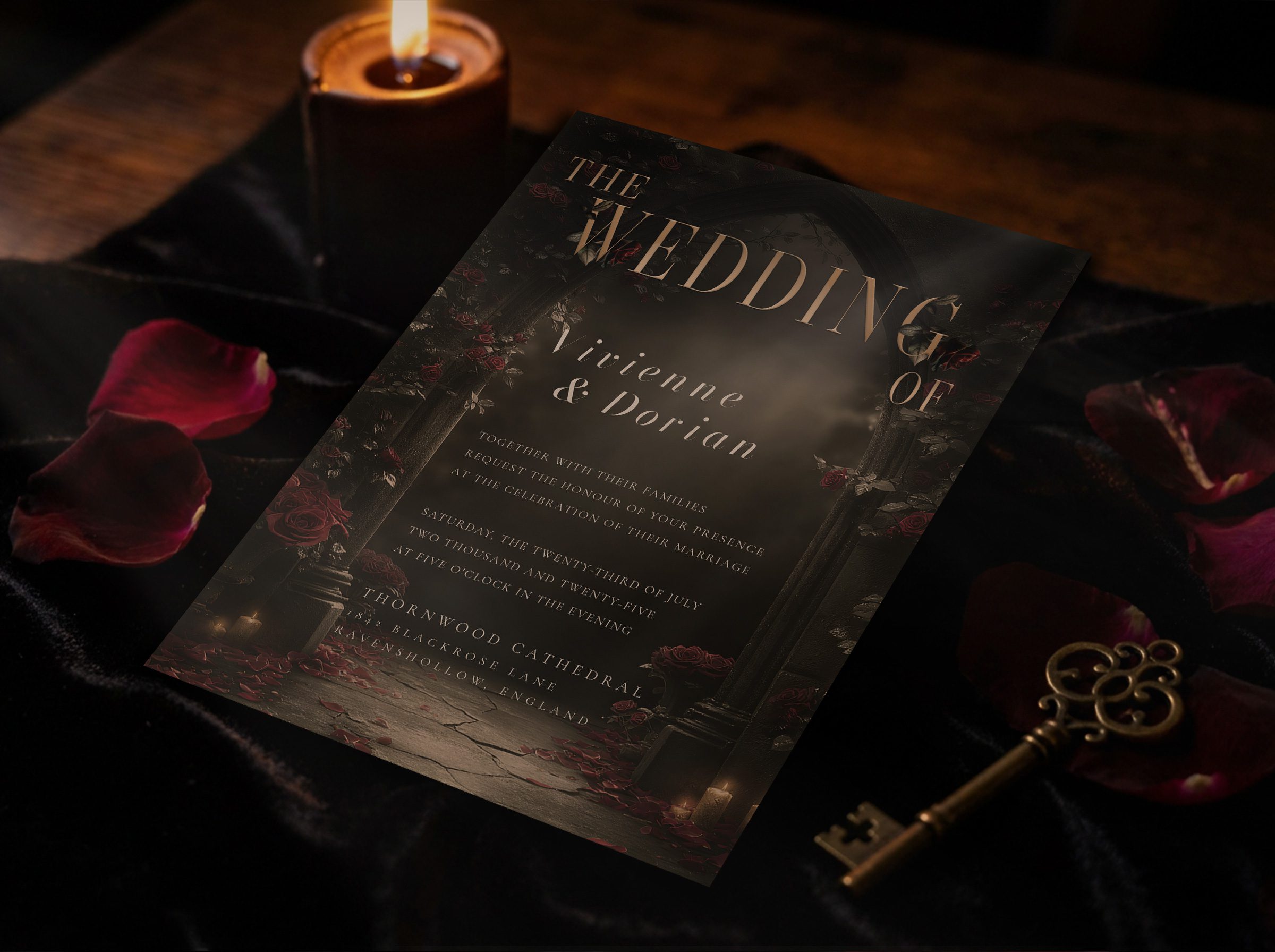
Stationery: Full-bleed dark backgrounds with Candlelight Amber metallic typography set the tone before guests ever arrive. The Dark Romance Essentials Suite uses this exact palette: oxblood florals, Plum Noir backgrounds, and candlelight amber effect details that glow when they catch the light.
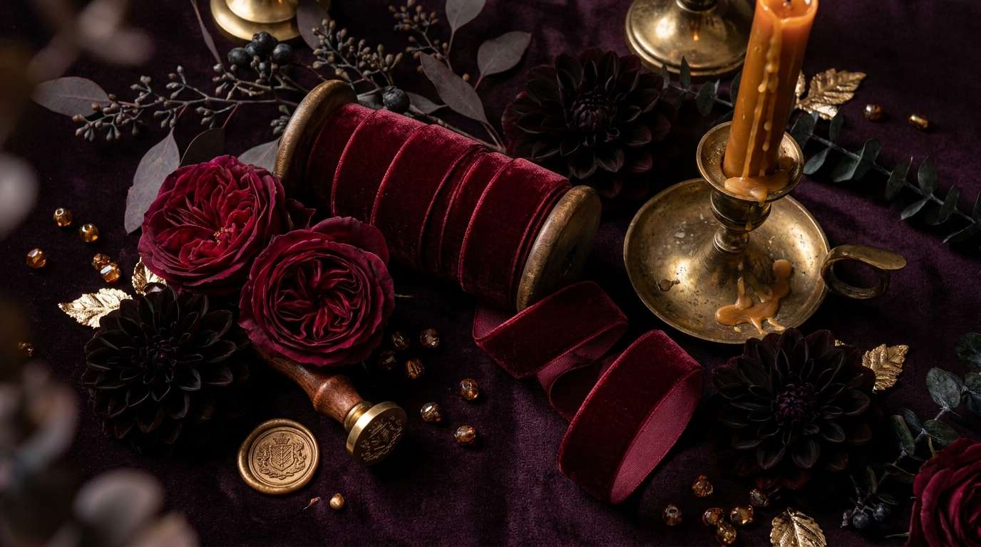
Florals: Oxblood roses, plum ranunculus, dark dahlias, and dried elements in amber tones. Ask your florist for arrangements that feel gathered rather than structured: organic shapes echo the romantic mood better than geometric precision.
Tablescapes: Plum Noir runners over dark wood or Cathedral Black linens, amber candleholders clustered at varying heights, black chargers, Antique Cream napkins. The table should feel like a scene from a candlelit feast in a manor house.
Venue: Dark draping, candlelight as the primary light source, minimal uplighting. If you use uplighting, keep it in a warm amber wash, never cool-toned. The venue should feel enclosed and intimate, even in a large space.
Fashion: Oxblood lips, amber and bronze jewelry, deep wine or black gowns. Metallics in hair accessories should match the Candlelight Amber tone, not bright gold or silver.
What This Palette Is Not
Because dark wedding palettes get lumped together constantly, it is worth naming what dark romance is not.
It is not burgundy and blush. Blush softens the palette into something sweet. Dark romance is not sweet. It is sensual, dramatic, and grounded in shadow.
It is not black and gold. That is Art Deco territory: geometric, urban, high-contrast. A completely different mood and a completely different ThornBloom collection.
It is not Halloween. No orange, no bright red, no novelty. The distinction is intention: dark romance is warm, intimate, and deeply deliberate. The amber grounds the darkness in warmth rather than whimsy.
If you are exploring other fantasy wedding color palettes, you will see how dramatically temperature and metallic choice shift the entire mood, even between collections that all live on the dark end of the spectrum.
Bring the Palette to Life
Ready to see these colors in action? The Dark Romance Essentials Suite translates every tone from this guide into coordinated stationery: invitation through details card, all on full-bleed dark backgrounds with Candlelight Amber metallic type.
For the complete vision, from plum noir wedding inspiration to ceremony design, read our full dark romance wedding guide.
And if you are still in the early planning stages, download the free wedding planner and start organizing your palette, vendors, and timeline in one place.