Choosing a fantasy wedding color palette is one of the most exciting decisions you will make during the planning process. Color sets the entire mood of your celebration: from the first save-the-date your guests receive to the final sparkler send-off. Whether you dream of fairy tale wedding colors inspired by an enchanted woodland, a moody romantic wedding palette dripping in oxblood and plum, or a scholarly dark academia aesthetic steeped in candlelit warmth, the right palette transforms your wedding from beautiful to truly unforgettable.
For a complete guide to bringing these palettes to life, explore our dark fantasy wedding planning guide.
At ThornBloom Studio, we design luxury digital stationery around eight distinct fantasy themes, each with its own carefully curated color story. Below, we break down each palette so you can find the one that speaks to your vision. You will also see how coordinated stationery brings every shade together, from invitation to place card.
In This Article
In This Guide
- Enchanted Forest: Woodland Magic in Green and Gold
- Dark Romance: Gothic Drama for the Bold Couple
- Midnight Celestial: Starlit Wonder in Navy and Gold
- Velvet Opera: Venetian Mystery and Crimson Velvet
- Jet Noir: 1920s Glamour Meets Film Noir
- Dark Academia: Scholarly Elegance and Candlelit Warmth
- Rococo Palace: Dark Baroque Opulence at Versailles
- Ember Court: Medieval Dragon Fantasy in Fire and Gold
1. Enchanted Forest: Woodland Magic in Green and Gold
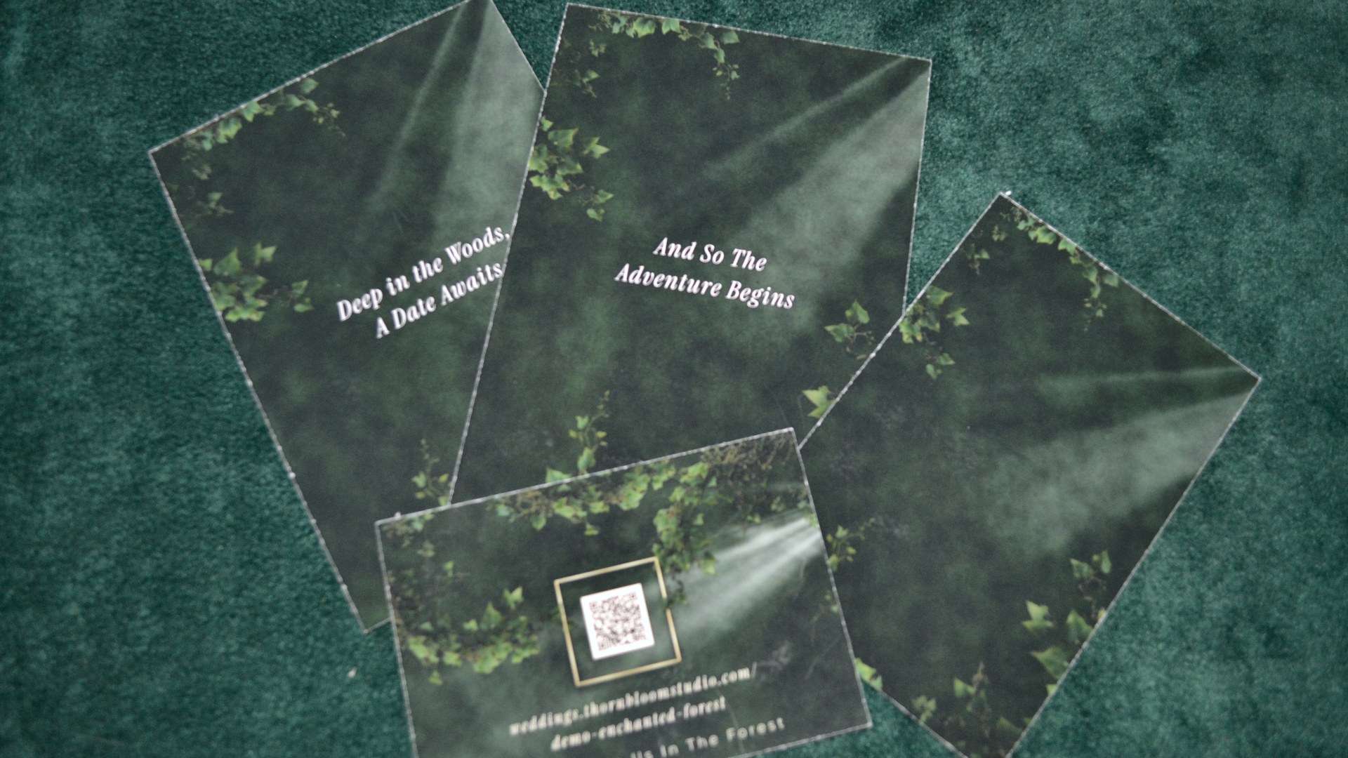
If you have always imagined saying your vows beneath a canopy of ancient trees, the Enchanted Forest palette was made for you. This color story draws from the natural beauty of old-growth woodlands, pairing deep evergreen tones with warm metallic accents that catch the light like sunbeams through leaves.
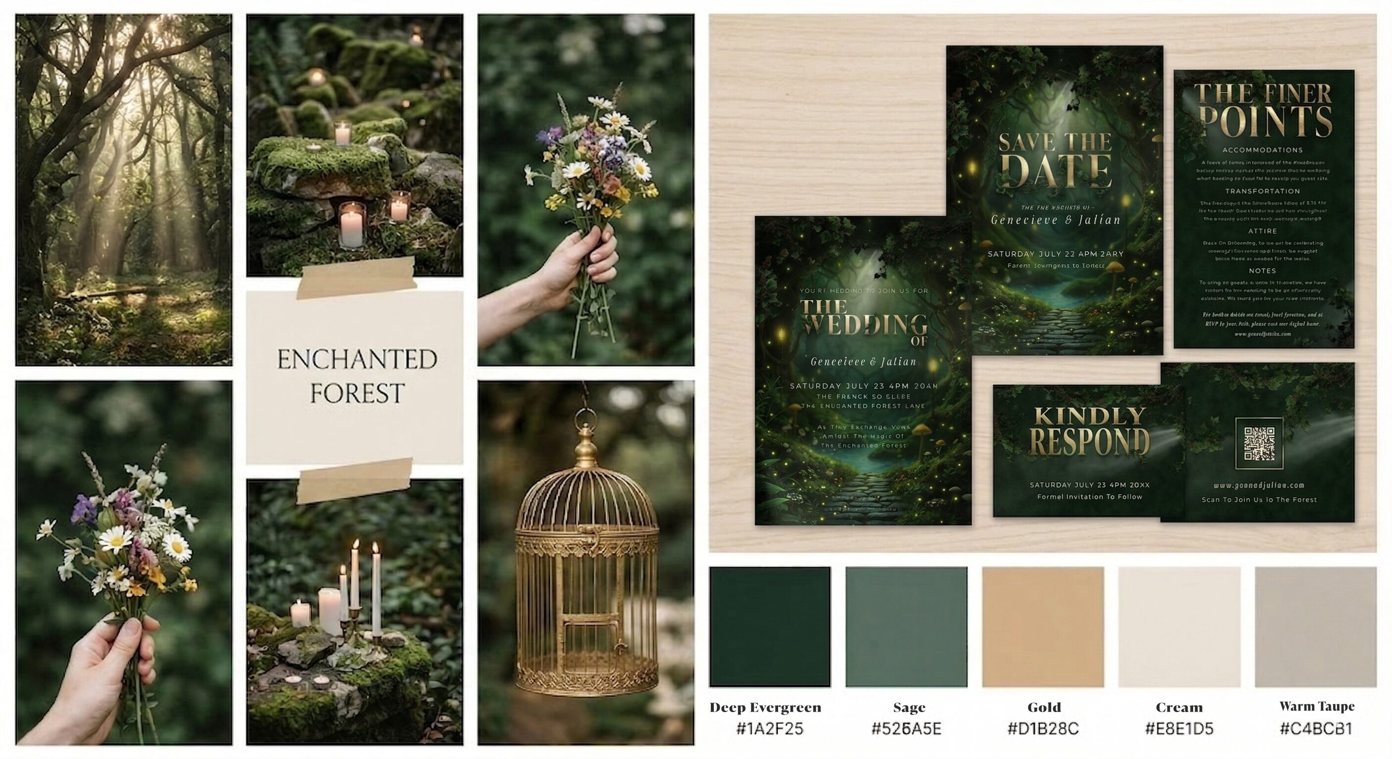
- Dark Forest Green (#1A2F25): the rich, grounding anchor of the collection
- Deep Forest (#2d4a3a): a secondary green that adds depth and dimension
- Brand Gold (#D1B28C): warm metallic accents that feel gilded, not gaudy
- Cream (#E8E1D5): a natural ivory for backgrounds and text contrast
- Warm Taupe (#C4BCB1): earthy neutral that ties every element together
- Sage (#526A5E): a softer green for balance and readability
Mood: Timeless, organic, quietly luxurious. Think moss-covered stone, candlelight, and hand-lettered calligraphy on thick cotton paper.
Best for: Garden venues, estate weddings, barn receptions with elegant upgrades, and any autumn or late-summer celebration. This palette also shines during winter weddings where you want warmth without holiday red-and-green cliches.
When every piece of your stationery, from the invitation suite to the bar menu and seating chart, carries these coordinated tones, your guests experience one visual story before they even arrive. Explore the full Enchanted Forest collection to see how each piece brings this woodland palette to life.
2. Dark Romance: Gothic Drama for the Bold Couple
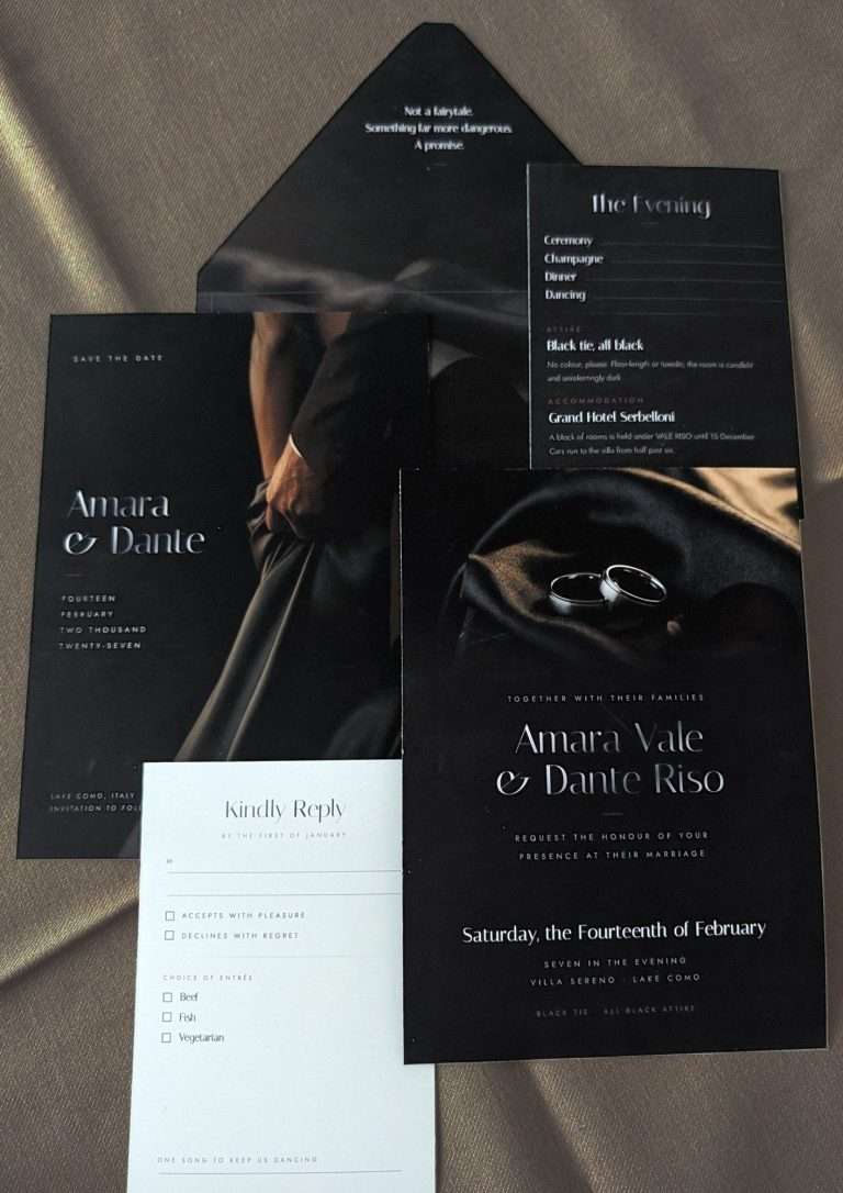
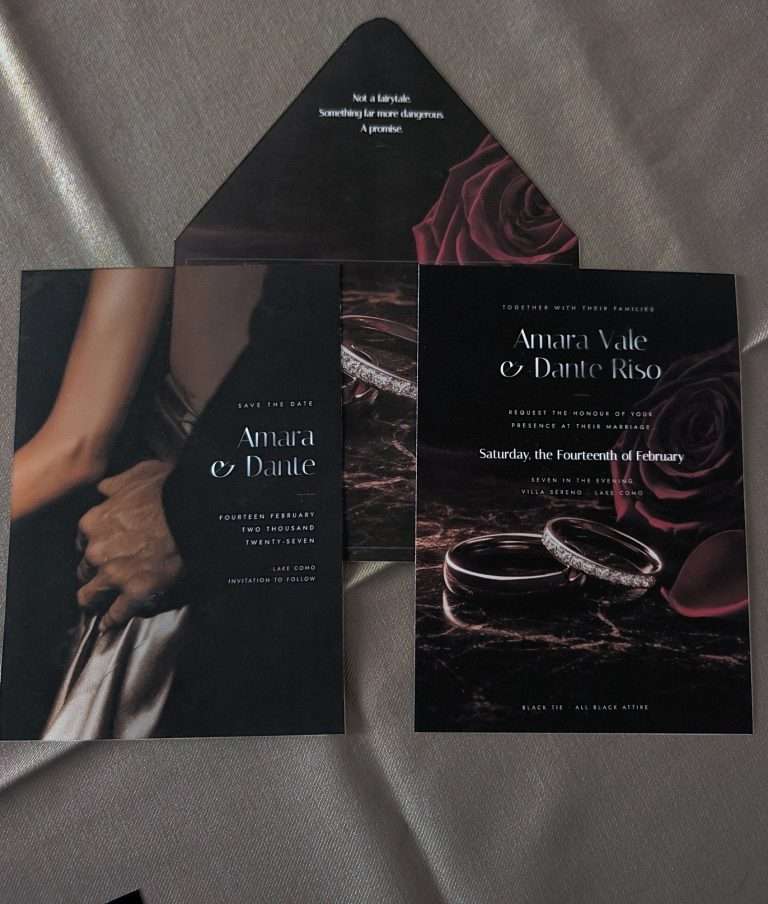
Dark Romance is for the couple who wants their wedding to feel like a scene from a gothic novel: atmospheric, intense, and unapologetically dramatic. This moody romantic wedding palette leans into shadow and depth, pairing deep oxblood and plum tones with a warm bronze-amber metallic that keeps things sumptuous rather than somber.
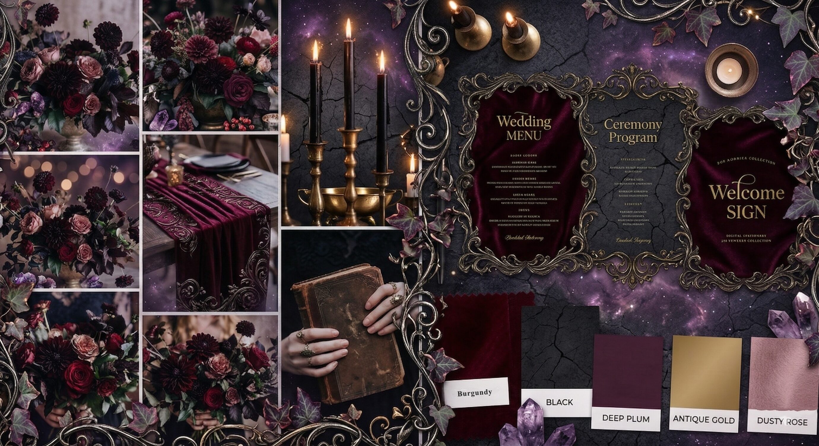
- Oxblood (#5C1A1B): the heart of the palette, rich as velvet and aged wine
- Plum Noir (#351E28): a purple so dark it reads almost as black in low light
- Candlelight Amber (#C4956A): warm bronze-amber metallic, like candlelight caught on antique brass
- Antique Cream (#E5DDD2): a soft ivory that softens the moodiness just enough
- Cathedral Black (#1A1015): the deepest shadow, dramatic and enveloping
- Dusty Rose Gray (#A89A95): a muted warm neutral for secondary text and subtle details
Mood: Passionate, cinematic, unapologetically bold. Think dripping candles, overflowing floral arrangements with dark dahlias, and velvet table runners in a gothic cathedral.
Best for: Historic mansions, old cathedrals, wine cellars, converted warehouses, and candlelit evening receptions. This palette is at its most powerful in autumn and winter, although a late-summer garden wedding at golden hour can be equally breathtaking.
Because the Dark Romance palette relies on deep, saturated tones, your stationery becomes a tactile experience even in digital form. Cathedral Black backgrounds with Candlelight Amber typography feel instantly luxurious, while Oxblood accent details give each piece, menus, programs, welcome signs, a sense of richness that plain white paper cannot deliver. Explore the full Dark Romance collection to see how each piece carries this gothic palette.
3. Midnight Celestial: Starlit Wonder in Navy and Gold
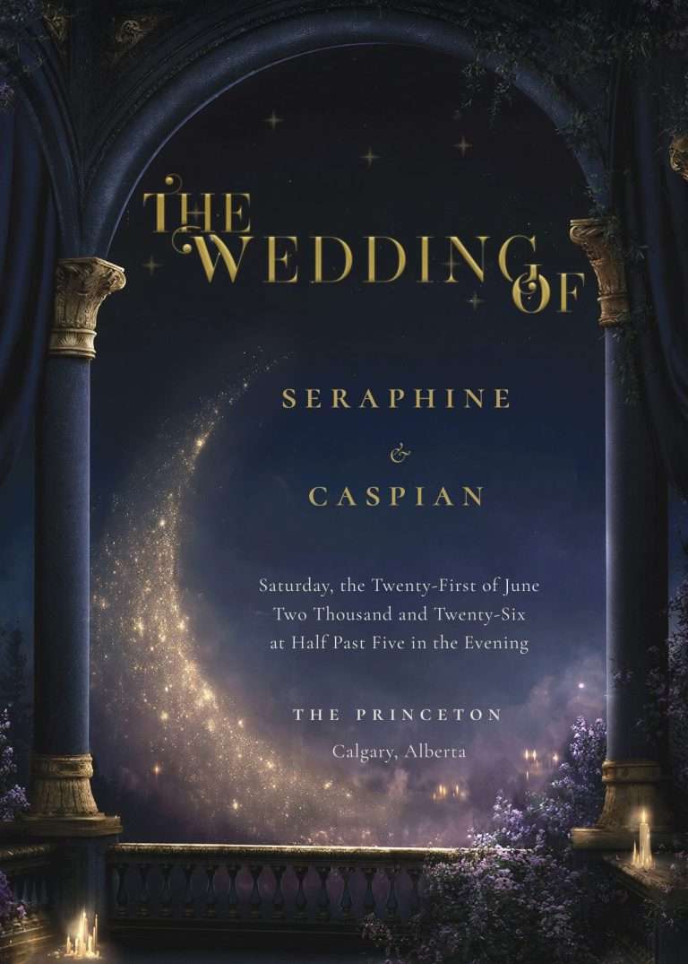
Midnight Celestial is for the couple who wants their wedding to feel like a night sky opened just for them: luminous, infinite, and quietly otherworldly. This palette trades gothic heaviness for deep midnight navy lit from within by starlight, crescent moons, and constellations traced in a cool, muted gold. It is the only blue-lane palette in our collection, and the closest we come to celestial whimsigoth: dreamlike and faintly witchy, without ever tipping into costume.
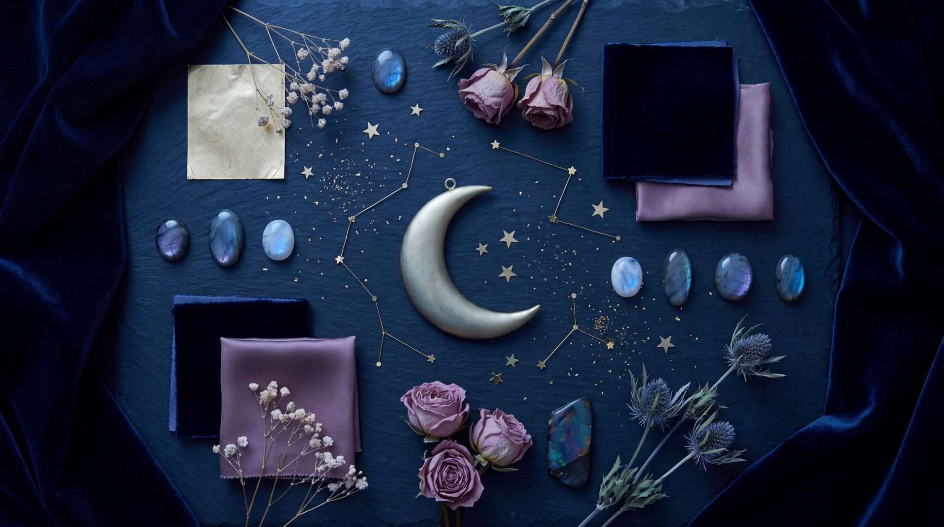
- Midnight Veil (#1B2340): deep midnight navy, the color of the sky an hour after the last light leaves it
- Obsidian Navy (#0E1528): a darker navy that anchors the palette where midnight deepens toward the horizon
- Starforge Gold (#B8A060): cool, muted metallic for constellations, crescent moons, and fine hairline typography
- Dusty Mauve (#C4A0A8): soft blush-violet for celestial botanicals, moon fills, and secondary highlights
- Celestial Black (#0A0E1A): the deepest base, a blue-black like the space between stars
- Moonlit Cream (#EDE6DA): soft warm ivory for body text and light typographic details
- Twilight Slate (#7A849C): cool muted blue-gray for secondary text and subtle details
Mood: Ethereal, luminous, quietly infinite. Think a sky thick with stars over still water, opalescent stone catching candlelight, moon-pale blooms and dried gypsophila, and gold constellations pressed into midnight velvet.
Best for: Observatory and planetarium venues, glasshouse receptions, rooftop terraces, desert and mountain settings under open sky, and any evening celebration that carries on well past dusk. This palette is at its most beautiful for late-summer and winter weddings, when clear skies turn the real constellations overhead into part of the decor.
Stationery in the Midnight Celestial palette works like a night sky in miniature. Celestial-black backgrounds with Starforge Gold constellations, an iridescent scatter of stars, and Dusty Mauve botanical detail give your invitation suite a soft luminosity that reads as luxury rather than novelty, and because every piece is set by the studio in the same coordinated tones, your save the dates, menus, and place cards all belong to the same sky. Preview the Midnight Celestial collection (opening next).
4. Velvet Opera: Venetian Mystery and Crimson Velvet
For couples drawn to the theatrical mystery of a Venetian masquerade, this palette transforms your celebration into an evening of intrigue. Crimson velvet curtains part to reveal gilded masks, candlelit chandeliers cast golden light across the ballroom floor, and every detail whispers of secrets and splendor. It is one of the most dramatic alternative wedding stationery color schemes in our collection.
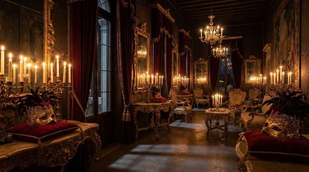
- Crimson Velvet (#7A1020): rich theatrical red, the color of heavy velvet curtains under candlelight
- Deep Wine (#4A0A12): darkened crimson that anchors the palette with shadowy depth
- Masquerade Gold (#BFA034): warm antique gold for ornate Venetian filigree, mask details, and theatrical accents
- Aged Ivory (#E8DFCC): softly yellowed ivory evoking vintage masquerade invitations
- Stage Black (#0A080A): the deepest theatrical black, the darkness behind the curtain
- Velvet Gray (#8A7E80): muted warm gray for secondary text and subtle background details
Mood: Theatrical, mysterious, darkly glamorous. Imagine Venetian masks catching golden candlelight, crimson curtains framing a grand ballroom, and guests discovering their table assignments tucked inside sealed envelopes.
Best for: Grand ballrooms, opera houses, historic theaters, wine cellars, and any evening celebration where you want drama, intrigue, and spectacle. This palette is breathtaking for masquerade-themed events, New Year’s Eve weddings, and Halloween-adjacent autumn celebrations.
Stationery in the Velvet Opera palette turns every piece into a theatrical artifact. Stage-black backgrounds with golden filigree typography and crimson velvet accents tell your guests this will be no ordinary wedding. It will be a performance, and they are the honored audience. Preview the Velvet Opera collection (launching soon).
5. Jet Noir: 1920s Glamour Meets Film Noir
Jet Noir channels the intoxicating glamour of a midnight ballroom in the roaring twenties. Geometric gold patterns catch dramatic spotlight against jet-black marble, champagne towers gleam beneath crystal chandeliers, and every angular detail drips with film noir sophistication. It is bold, architectural, and impossibly glamorous.
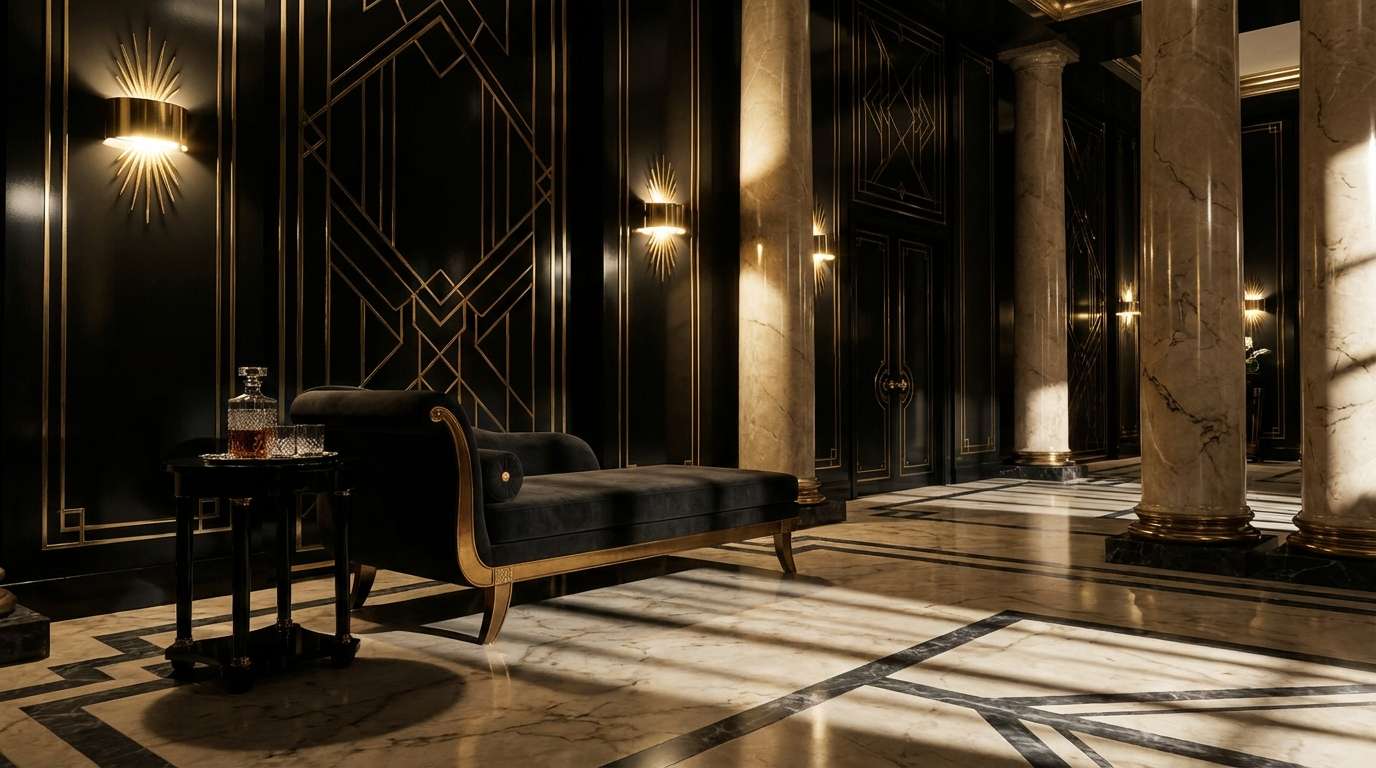
- Jet Noir (#141418): near-black with a cool blue-gray undertone, the film noir darkness that defines this collection
- Charcoal Graphite (#3A3A3E): cool-neutral dark gray for geometric pattern fills and structural elements
- Champagne (#D4C5A9): the dominant light tone evoking 1920s champagne glamour for geometric shapes and typography
- Deco Gold (#C9A832): warm antique gold for geometric borders, angular ornaments, and Art Deco fan motifs
- Noir Silver (#9B9EA6): cool metallic complement for thin geometric lines and secondary decorative details
- Pearl Ivory (#EDE8DF): soft warm white for body text and light typographic elements
- Smoke Gray (#8A8B90): muted neutral for secondary text and subtle details
Mood: Dramatic, glamorous, architecturally bold. Think champagne towers catching spotlight, geometric gold patterns on black marble, angular mirrors reflecting candlelight, and the magnetic energy of a 1920s ballroom.
Best for: Grand ballrooms, art deco hotels, rooftop lounges, jazz clubs, and historic theaters. This palette is stunning for New Year’s Eve celebrations, black-tie affairs, and any couple drawn to the geometry and glamour of the jazz age.
When your stationery carries this palette from the first save-the-date through the thank-you card, it builds anticipation for the setting itself. Jet-black invitations with geometric gold typography tell your guests exactly what kind of experience awaits, and coordinated menus, programs, and signs at the reception complete the look. Preview the Jet Noir collection (launching soon).
6. Dark Academia: Scholarly Elegance and Candlelit Warmth
The Dark Academia palette is for couples who want their wedding to feel like stepping into a candlelit library from a classic novel: warm, intellectual, and steeped in old-world romance. Inspired by leather-bound volumes, wax-sealed love letters, brass reading lamps, and the amber glow of firelight on aged wood, this palette trades bold jewel tones for a richer, more scholarly kind of magic.
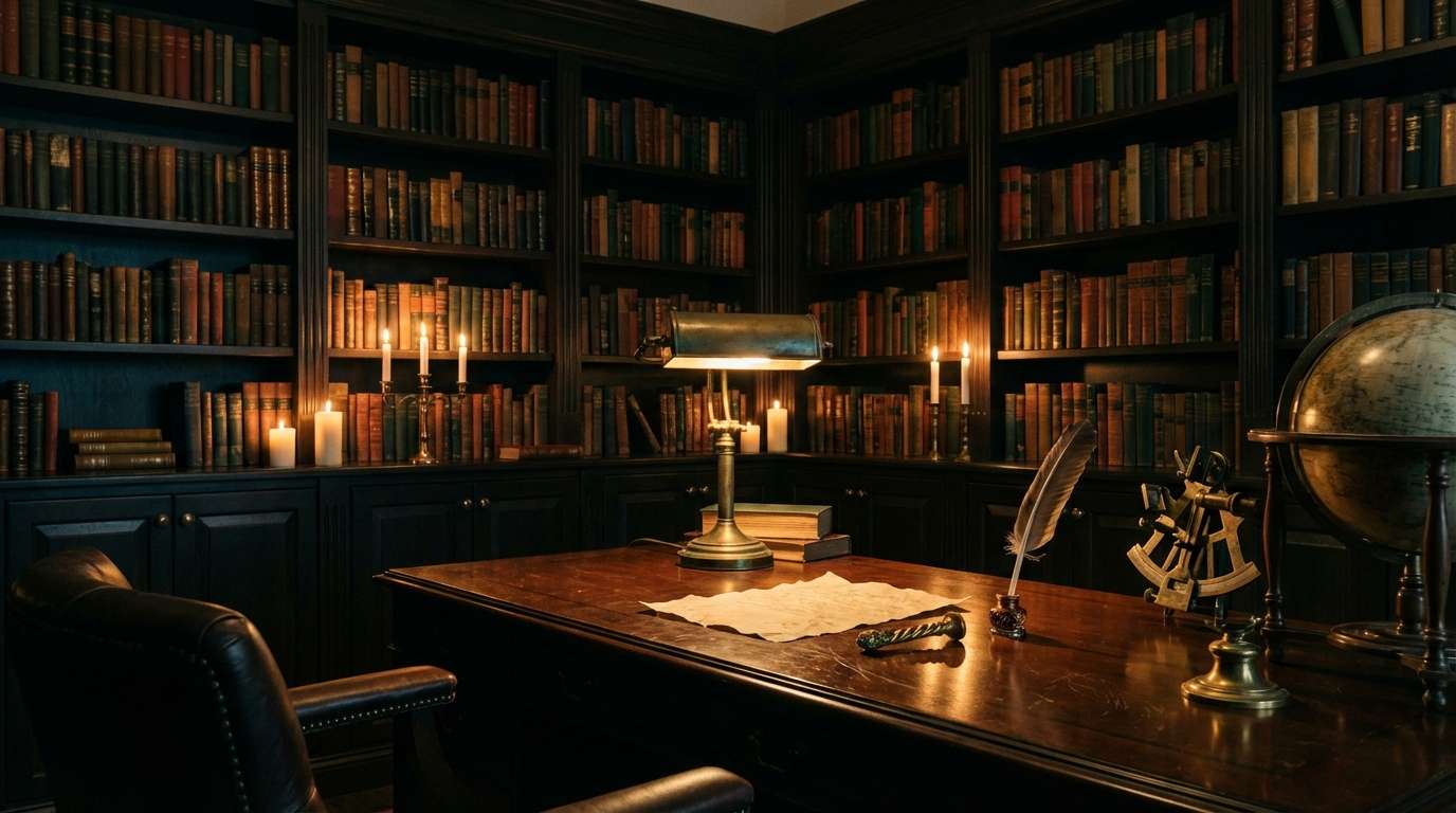
- Library Midnight (#181210): near-black with a warm brown undertone, the darkness of an unlit library at midnight
- Deep Espresso (#3B2820): rich leather and aged wood, the warm brown of well-worn book spines
- Aged Parchment (#C8B99A): warm ivory-tan evoking centuries-old manuscripts and yellowed love letters
- Antiquarian Brass (#A08540): warm antique gold for wax seal effects, embossed monograms, and classical border ornaments
- Oxblood Ink (#7A3330): deep scholarly red evoking wax seals and red ink marginalia in ancient texts
- Vellum (#E2D9CB): soft warm ivory for body text and parchment-like backgrounds
- Faded Ink (#9A8E7E): muted warm gray for secondary text and subtle aged details
Mood: Warm, intellectual, deeply romantic. Think candlelit libraries with leather armchairs, vintage wax seals pressed into aged parchment, classical architecture, brass instruments gleaming in amber light, and the quiet intimacy of love letters exchanged between bookshelves.
Best for: Historic libraries, university chapels, museum venues, old-world restaurants, candlelit manor houses, and any celebration where intellectual elegance meets romantic warmth. This palette is especially magical for autumn and winter weddings, where the amber glow of candlelight brings every espresso and gold tone to life.
Stationery in the Dark Academia palette creates a sense of scholarly romance. Deep espresso backgrounds with gold-toned typography, parchment-framed borders, and oxblood ink accent details give your invitation suite the feeling of a love letter discovered in an old library: lasting, tender, and full of promise. Preview the Dark Academia collection (launching soon).
7. Rococo Palace: Dark Baroque Opulence at Versailles
Inspired by the ornate halls of Versailles reimagined at midnight, the Rococo Palace palette is dark opulence at its most magnificent. Deep aubergine walls draped in gilded filigree, candlelight flickering off gold leaf ceilings, and the intoxicating weight of baroque maximalism. Every shade evokes a midnight ball in a palace where extravagance is the only language spoken. If your fantasy wedding color palette leans toward more-is-more elegance, this is your match.
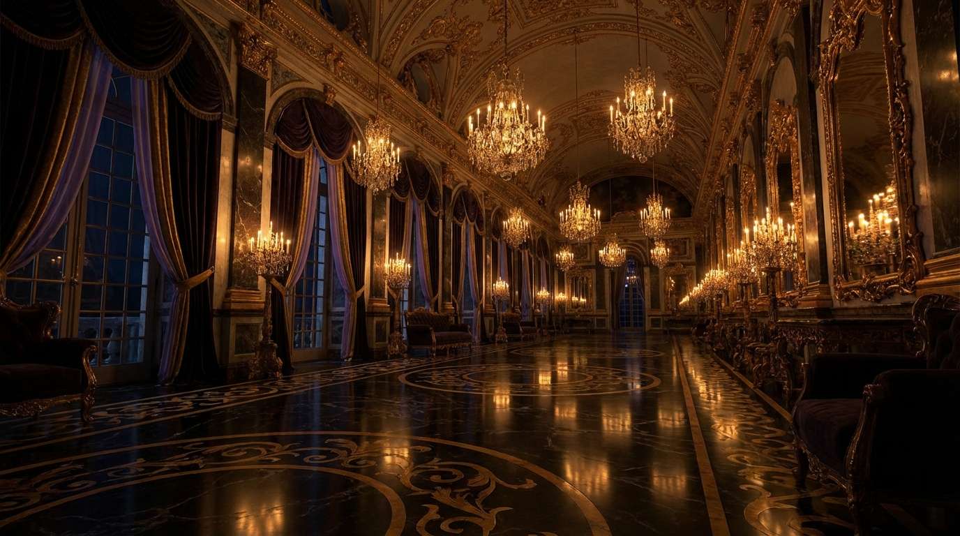
- Royal Aubergine (#3A1F35): deep violet-plum, the color of velvet drapes in a darkened palace corridor
- Gilded Violet (#52354A): a secondary violet that catches the light where aubergine fades to shadow
- Gilded Antique (#C4A24E): rich, saturated gold evoking real gold leaf on baroque ceilings and ornate frames
- Antique Pearl (#D8CFC0): warm ivory-pearl for elegant body text and soft contrast
- Palatial Black (#120E15): the deepest base, a near-black with violet undertones like a palace at midnight
- Ivory Silk (#E7E0D6): soft warm white for text and delicate typographic details
- Faded Damask (#8A7E88): muted violet-gray for secondary text and ornamental fine print
Mood: Regal, maximalist, darkly lavish. Think Versailles after the guests have gone: candlelight catching gold leaf, aubergine shadows pooling in gilded corners, and the scent of old roses clinging to velvet.
Best for: Grand ballrooms, luxury hotels, chateau-style venues, and historic estates with ornamental architecture. This palette is the most gold-forward in our collection: heavy gilding, ornate scrollwork, and baroque filigree on every surface. It is stunning in any season, especially when candlelight and crystal amplify the dark aubergine and rich gold tones.
Rococo Palace stationery thrives on detail. Gilded Antique borders, delicate scrollwork, and layered textures on palatial-black backgrounds give your invitations, place cards, and programs the feeling of priceless artifacts from a midnight ball. Each piece in this collection is designed to feel like a tiny work of art. Preview the Rococo Palace collection (launching soon).
8. Ember Court: Medieval Dragon Fantasy in Fire and Gold
Ember Court is for the couple who wants their wedding to feel like a feast in a dragon’s hall: epic, ancient, and blazing with fire and sovereign gold. Inspired by medieval heraldry, volcanic landscapes, and the dark grandeur of dragon fantasy, this palette brings the heat of forge-fire and the weight of obsidian stone to every detail. It is the most dramatic and elemental palette in our collection.
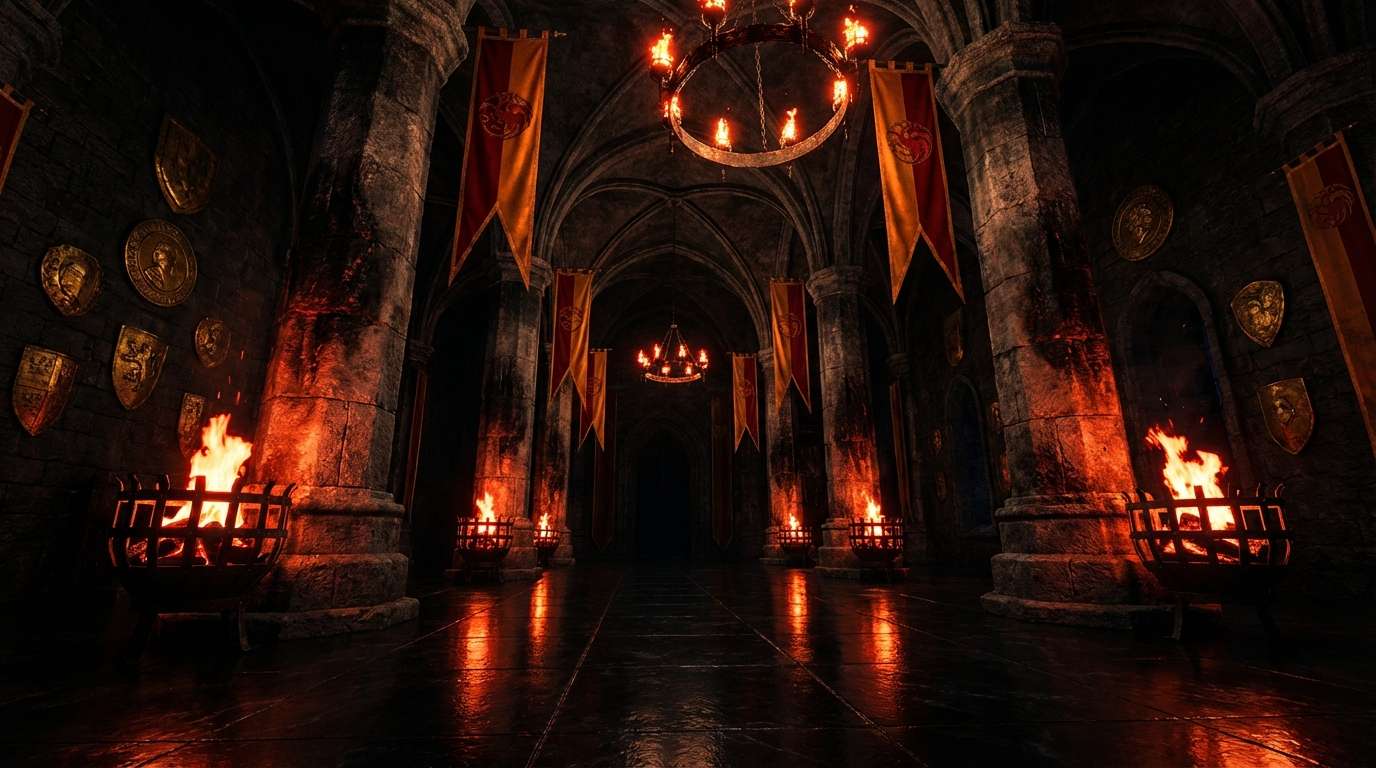
- Dragonfire Crimson (#7C1009): the deep, smoldering red of dragon flame, intense and commanding
- Scorched Earth (#28251F): dark brown-black evoking charred wood and ancient stone walls
- Sovereign Gold (#C49030): deep, burnished gold that evokes dragon hoards and medieval heraldry
- Molten Ember (#A86332): warm copper-bronze, the glow of molten metal in a forge
- Obsidian (#0C0C14): volcanic glass black, the darkest base in our collection
- Parchment Cream (#E5DDD2): aged parchment for body text and ancient scroll-like details
- Ash Gray (#8A847E): the color of cooled volcanic ash for secondary text and muted details
Mood: Epic, ancient, volcanic. Think a great hall lit by firelight, heraldic crests carved in stone, wyvern motifs traced in sovereign gold, and the smoldering intensity of a world where fire and stone meet.
Best for: Castle venues, grand stone halls, medieval banquet spaces, candlelit cathedrals, and dramatic outdoor settings with natural rock or fire features. This palette is breathtaking for autumn and winter weddings, and for any couple drawn to dragon fantasy, medieval high-fantasy sagas, and dark epic romance.
Ember Court stationery channels the weight of ancient heraldry. Obsidian-black backgrounds with Sovereign Gold crests, scorched-edge textures, and Dragonfire Crimson accents give your invitation suite the feeling of a royal decree delivered by raven. Every piece, from the save-the-date to the seating chart, carries the volcanic drama of this palette. Preview the Ember Court collection (launching soon).
Once you have chosen your palette, learn which stationery pieces to include with our Wedding Stationery 101 guide.
How to Bring Your Fantasy Wedding Color Palette to Life
Once you have chosen the palette that resonates with your vision, the key to making it feel intentional is consistency. Your color story should flow from the very first piece of communication your guests receive all the way through to the last detail at the reception. That means your invitations, RSVP cards, menus, welcome signs, seating charts, and even favor tags should all speak the same visual language.
This is exactly why we design full stationery suites rather than standalone pieces. When every piece is created within the same palette and design system, nothing feels mismatched or afterthought. You can start with The Essentials Suite for your core pieces: invitation, save the date, RSVP, and details card, and expand from there as your plans take shape.
Every suite is set for you by the studio. Choose your collection, send your details, approve your proof, and your print-ready files and shareable digital versions arrive finished. It is that simple.
Your fairy tale wedding colors are more than a set of shades. They are the visual thread that weaves through every moment of your celebration, from the excitement of opening that first envelope to the final photograph of the night. Choose the one that makes your heart race. Let the stationery do the rest.
Find Your Perfect Palette
Be the first to know when new collections launch. Plus, get a free Wedding Planner Bundle (Google Sheets, Notion & printable checklist) to organize your vision.